The rule of thirds in interior design is a simple way to organize what your eye sees without making a room feel rigid or over-planned. Imagine a wall, room view, shelf, or photo divided into nine equal areas by two vertical and two horizontal lines. You can then use those lines and their four intersections to test the placement of furniture, artwork, lighting, and decor.
Quick Answer
The rule of thirds divides a view into a 3-by-3 grid with four intersection points. In interiors, you can use the grid to position focal points, balance visual weight, and preserve open space. It is a flexible composition guide, not a requirement, and it should never override circulation, safety, accessibility, or architecture.
Key Takeaways
- The rule of thirds divides a room view or surface into a three-by-three grid with four intersections.
- Use grid lines and intersections as possible locations for focal points such as a bed, fireplace, island, artwork, lamp, or tall plant.
- Balance visual weight across the upper, middle, and lower parts of a composition instead of forcing every item onto a line.
- Treat the rule of thirds and the rule of three as separate ideas: one organizes composition, while the other groups or repeats three elements.
- Break the grid whenever symmetry, architecture, circulation, accessibility, or your preferred style produces a better result.
At a Glance
| Time Required | 5–15 minutes to test a room view or furniture arrangement |
| Difficulty | Easy |
| Tools Needed | None; a phone photo, sketch, or removable painter’s tape can help |
| Cost | Usually $0 when rearranging what you already own |
What Is the Rule of Thirds?
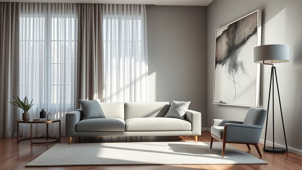
The rule of thirds is a composition technique that divides a view into nine equal sections using two horizontal and two vertical lines. Those lines create four intersection points. In photography and graphic composition, important subjects are often placed on or near those lines instead of automatically being centered.
You can adapt the same idea to interior design. Instead of treating the grid as an exact measuring system, use it to study visual weight, empty space, height, and focal points. A fireplace might sit near one vertical third, artwork may occupy the upper third of a wall composition, and a chair or plant may balance the opposite side.
The technique works best when you treat it as a visual guideline. Adobe describes the rule of thirds as a composition method rather than a rigid law, which is also the safest way to use it in a room. Adobe’s rule-of-thirds guide explains the 3-by-3 grid and its four key intersections.
The rule of thirds is also different from the rule of three. The rule of thirds concerns where elements sit within a composition. The rule of three is a styling idea that uses three related objects, colors, shapes, or repeated elements.
How to Apply the Rule of Thirds Grid
Start with one view at a time rather than trying to grid the entire house. You might look toward the main wall from the doorway, stand where you usually sit on the sofa, study the wall behind your bed, or photograph a bookshelf straight on.
- Choose the view. Decide what part of the room you are composing.
- Imagine a 3-by-3 grid. Divide the view with two horizontal and two vertical lines.
- Identify the four intersections. These are useful places to test focal elements, but they are not mandatory targets.
- Find the visual anchor. This may be a fireplace, bed, sofa, island, window, artwork, or another dominant feature.
- Balance the opposite areas. Use lighter furniture, lamps, plants, artwork, or open space so one section does not feel unnecessarily heavy.
- Step back and edit. Remove anything that makes the composition feel crowded even if it technically sits on the grid.
Pro Tip: Take a straight-on phone photo of the room and turn on a crop or camera grid. It is often easier to judge thirds, empty space, and competing focal points in a flat image than while standing inside the room.
Taller items such as floor lamps, bookcases, plants, or artwork can help carry visual weight into the upper part of the room. Lower furniture and rugs ground the bottom. The middle area often holds the main furniture and human activity. You do not need equal amounts in each third; the goal is a composition that feels deliberate rather than mechanically divided.
How to Use the Rule of Thirds in Kitchens
In a kitchen, use the rule of thirds for visual composition only after the functional layout works. Appliance locations, work areas, door swings, circulation, landing space, electrical planning, ventilation, accessibility, and required clearances are more important than placing anything on an aesthetic grid.
The National Kitchen & Bath Association’s current planning guidance focuses on safe and effective work centers, access, clearances, systems, storage, and circulation. Its 2026 fifth-edition update also places greater emphasis on activity zones and accessible design. See the NKBA Planning Guidelines.
Note: Do not move a sink, refrigerator, cooktop, island, or electrical connection simply to hit a rule-of-thirds intersection. Function, code requirements, manufacturer instructions, accessibility, and safe circulation come first.
Frame the Work Triangle
The traditional work triangle connects the refrigerator, sink, and primary cooking surface. It can still be useful in some kitchens, although modern layouts may also be planned around several work centers or activity zones.
Use functional kitchen-planning guidance to locate those elements first. Once the plan works, you can apply the rule of thirds to the view of the kitchen. For example, cabinetry might create a strong vertical third, a window may provide open space in another, and the cooking area or island may become the dominant visual anchor.
- Plan appliance and work-center relationships for practical use.
- Protect clear circulation paths and door swings.
- Check work aisles and required clearances.
- Then use the thirds grid to refine cabinetry, lighting, art, and open space visually.
This keeps the work triangle or activity zones functional without pretending that a composition grid determines where plumbing or appliances belong.
Place Island Focal Points
An island often becomes a strong focal point because of its size and central position. If the island is already correctly sized and placed for circulation, use the rule of thirds to refine what happens around it.
Pendant lights might align with a visual third of the room, a range hood may create a strong upper focal point, and stools may form a lower rhythm beneath the counter. Nearby windows or tall cabinetry can provide counterweight so the island does not feel visually isolated.
Do not force the island itself onto an intersection if doing so produces cramped aisles, awkward appliance doors, or poor circulation.
Balance Light and Open Space
Natural light, pale finishes, open shelves, clear countertops, and uninterrupted sightlines can act as visual breathing room. In a smaller kitchen, empty space may contribute as much to the composition as another decorative object.
- Keep major sightlines as open as the layout allows.
- Group countertop appliances rather than scattering them across every surface.
- Use plants or a few accessories to soften hard cabinetry lines.
- Let lighting reinforce the main work and gathering areas.
The thirds grid is most useful here as an editing tool: if every section of the view is visually busy, remove or simplify something.
Use the Rule of Thirds in Living Rooms
In a living room, begin with the feature that naturally deserves attention. It may be a fireplace, window, media wall, large artwork, or the conversation area itself. That feature does not have to sit exactly on a grid line, but the grid can help you decide whether the surrounding furniture supports or competes with it.
A sofa can occupy a strong lower or middle portion of the composition while artwork, sconces, curtains, or a tall plant carry the eye upward. Chairs and side tables can create counterweight on the opposite side instead of crowding the center.
Use an area rug to connect the seating group rather than trying to make it cover an arbitrary percentage of the floor. Depending on the room and rug size, that may mean placing all furniture legs on the rug or at least the front legs of major seating pieces on it.
Accessories can be grouped in threes when that suits the arrangement. A vase, stack of books, and sculptural object can form a simple vignette, but you do not need to repeat three objects on every table.
Use the grid to organize visual attention, not to force every chair, lamp, and accessory into a mathematical position.
Use the Rule of Thirds in Bedrooms
A bedroom often benefits from more symmetry than a living room, especially when the bed is centered on a wall with matching nightstands or lamps. That does not mean the rule of thirds is useless. It simply means you can apply it to the whole composition instead of moving the bed off-center for no reason.
- Use the bed as the main visual anchor when it naturally belongs on the room’s strongest wall.
- Let artwork, a headboard, or tall lamps provide interest in the upper third.
- Use the rug, bench, bed frame, and bedding to create weight in the lower third.
- Add an asymmetrical plant, chair, artwork grouping, or decorative object only when the room needs additional visual balance.
This is also where the difference between the rule of thirds and the rule of three matters. You might use a thirds grid to judge the overall bed wall while separately using three cushions, three framed pieces, or three objects on a dresser as a styling choice.
Matched pairs are completely appropriate when you want a bedroom to feel calmer or more formal. A useful design guideline should help the room, not force you to break a layout that already works.
How to Style Artwork and Accessories
Artwork and accessories look strongest when scale, spacing, and the furniture beneath them work together. Use the rule of thirds as one way to test placement rather than assuming every frame must sit on an intersection.
For a large wall, imagine the grid across the full wall or across the furniture-and-art grouping. A single oversized piece may occupy a large central zone, while an asymmetrical arrangement might place its strongest piece closer to one vertical third.
Open shelving works the same way. Spread visual weight across the shelf instead of filling every section equally. Leave some empty space, vary heights, and avoid creating identical clusters from left to right.
The rule of three can be useful on a shelf, nightstand, or coffee table. A lamp, vase, and framed photo form one possible trio. Varying their height, shape, and texture usually creates more interest than using three nearly identical objects.
For larger surfaces, decorators sometimes extend the same odd-number idea into groups of three, five, or seven. Treat that as a styling shortcut, not a requirement. Scale and negative space matter more than the count alone.
When to Break the Rule of Thirds
The rule of thirds works best when you are willing to ignore it. Centering, symmetry, architectural alignment, and large uninterrupted forms can all be stronger choices.
- Center a dominant feature when a fireplace, bed, dining table, mirror, or artwork is meant to command the room.
- Use symmetry when matched lamps, chairs, windows, or architectural details create the calm or formality you want.
- Follow architecture first. Doors, windows, built-ins, ceiling changes, columns, and fireplaces often establish their own visual order.
- Protect circulation. Never worsen a walkway or usable clearance simply to place furniture on a grid line.
- Let one object stand alone. A large sculpture or artwork may have more impact with generous empty space around it.
- Use other compositions. Gallery walls, open-plan rooms, and highly symmetrical spaces may work better with a different structure.
Breaking the rule is not a design mistake. The goal is to understand what the grid is helping you see: focal points, visual weight, proportion, and empty space. Once those relationships are clear, you can choose the arrangement that best serves the room.
Frequently Asked Questions
What Is the Rule of 3 in Interior Design?
The rule of three is an informal styling technique that groups or repeats three elements, such as three accessories, three colors, or three shapes. It is not the same as the rule of thirds. The rule of thirds uses a 3-by-3 composition grid; the rule of three concerns the number of elements in a grouping.
What Is the 3-5-7 Rule in Decorating?
The 3-5-7 rule is a decorating shorthand for arranging accessories in odd-numbered groups such as three, five, or seven. It can help a shelf, mantel, coffee table, or pillow arrangement feel less rigid than a perfectly matched row. It is optional: scale, spacing, variety, and empty space matter more than simply counting objects.
What Is the 70/30 Rule in Decorating?
The 70/30 rule is an informal decorating guideline, not a professional requirement. One common version uses roughly 70% of an anchor style, color direction, or visual language and about 30% for contrast. It is better treated as a starting point for mixing styles than as a rule requiring 70% of a room to contain dominant furniture or colors.
What Is the Golden Rule in Interior Design?
There is no single universally accepted golden rule that governs every interior. Some decorators use a 60/40 approximation inspired by the golden ratio, but professional interior design also has to consider function, scale, circulation, safety, accessibility, materials, lighting, building requirements, and the people using the space. A percentage should therefore be a visual guide, not a fixed furniture quota.
Conclusion
The rule of thirds can make interior decisions easier because it gives you a simple way to study focal points, visual weight, height, and empty space. Divide the view into nine sections, remember that the grid has four intersections, and use those lines as possibilities rather than targets you must hit.
Apply the technique to living rooms, bedrooms, kitchens, artwork, and shelves, but keep function ahead of composition. Symmetry may suit a bedroom, architecture may dictate a living-room layout, and kitchen circulation must matter more than an aesthetic grid. Once you understand what the rule is showing you, you can follow it, adjust it, or ignore it with purpose.
Sources
- Adobe — Rule of Thirds — supports the 3-by-3 grid, four intersection points, focal placement, and the idea that the technique is a guideline rather than a rigid rule.
- National Kitchen & Bath Association — Planning Guidelines — supports professional kitchen-planning priorities such as layout, accessibility, work areas, clearances, systems, and safe use.
- NKBA — 2026 Planning Guidelines Update — supports the current fifth-edition emphasis on activity zones, accessibility, building systems, storage, and planning methodology.
- American Society of Interior Designers — About Interior Design — supports the broader professional emphasis on function, safety, accessibility, materials, codes, and human needs.