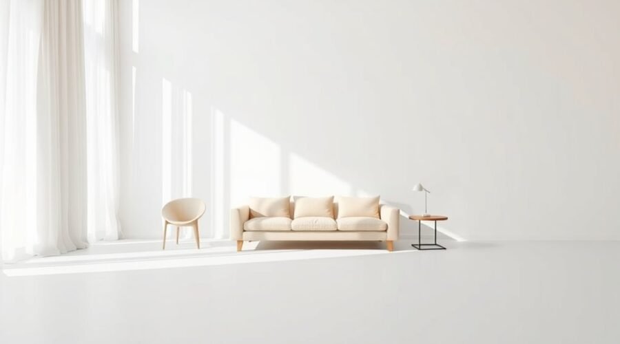
A room does not need furniture or decor in every available spot to feel finished. The open floor around a chair, the blank wall beside artwork, and the clear space between furniture groups are all forms of negative space. Used intentionally, these gaps make individual elements easier to notice, keep circulation clearer, and give the overall composition a more balanced, deliberate look.
Quick Answer
Negative space in interior design is the intentionally unoccupied area around and between furniture, artwork, decor, and architectural features. It helps separate visual groups, emphasize focal points, preserve clear movement paths, and prevent a room from looking overcrowded. Good negative space feels deliberate rather than forgotten or unfinished.
Key Takeaways
- Negative space is the unoccupied area around and between furniture, artwork, decor, and architectural elements.
- It can separate visual groups, clarify focal points, and keep a room from feeling unnecessarily crowded.
- There is no universal percentage of a room that must stay empty; scale, function, circulation, and visual balance matter more.
- Negative space works in minimalist and maximalist rooms alike because it is about intentional spacing, not simply owning fewer things.
- Clear pathways should come before decorative styling, especially where mobility or accessibility is a concern.
- The 3-5-7 method is an optional styling guideline for decorative groupings, not a formal interior-design rule.
What Is Negative Space in Interior Design?

Negative space is the unoccupied area around and between the objects in a composition. In a room, that can mean visible floor around furniture, blank wall around artwork, space between accessories on a shelf, or an open corner that has been deliberately left alone.
The idea also appears in art and graphic design. The Open University explains positive and negative space through the relationship between a subject and its surrounding background. In an interior, furniture, art, lighting, and decor usually form the positive space, while the areas around them form the negative space.
Negative space is not leftover space. When it is intentional, it becomes part of the composition and helps define what you want people to notice.
This is why an isolated chair, sculpture, pendant light, or painting can sometimes have more impact than the same object surrounded by several competing pieces. The open area acts as visual separation.
University of Wisconsin–Madison design guidance makes a similar point: spacing can separate elements that should read independently and can emphasize an important element by giving it more room. Although those principles are often taught for graphic communication, the underlying ideas of proximity, separation, and visual emphasis also help explain how negative space functions in a room.
Negative Space vs. Empty or Unfinished Space
Not every empty area automatically works as good negative space. The difference is intent.
A blank wall beside a large painting may strengthen the painting because the open area gives it visual weight. A blank wall surrounded by undersized furniture may instead make the room look unfinished. Likewise, an open floor area can improve circulation, while an awkward gap between a sofa and rug may simply make the furniture grouping feel disconnected.
Useful negative space normally supports at least one purpose:
- It creates a clear path for movement.
- It separates one furniture or decor group from another.
- It gives an important object more visual emphasis.
- It prevents a surface or wall from becoming visually crowded.
- It reveals an architectural feature, material, texture, or view that deserves attention.
Why Negative Space Can Make a Room Feel Calmer and More Balanced
Negative space creates visual pauses. Instead of asking your eyes to process many equally prominent objects at once, the composition contains quieter areas between them.
Research on visual clutter supports the narrower idea that clutter can affect attention and visual-search performance. For example, peer-reviewed research indexed by the U.S. National Library of Medicine has found relationships between clutter, visual organization, and search performance. A 2026 Journal of Vision study on visual clutter examined how item quantity, spatial organization, and surface complexity influence perceived clutter.
That does not mean an uncluttered living room is medically proven to reduce stress. In interior design, words such as calm, restful, and quiet are better understood as descriptions of how a composition may feel rather than guaranteed psychological effects.
Balance also does not require perfect symmetry. A large sofa on one side of a room can be visually counterbalanced by an open area, a window, a lighter chair, or a restrained wall rather than another equally heavy object.
How Negative Space Balances a Room
A room often feels more coherent when solid visual mass and open space are distributed intentionally. If every wall, tabletop, and corner carries the same amount of visual weight, nothing has much chance to stand out.
Use negative space as a design element rather than treating every open area as a problem that needs another object.
- Protect movement paths. Arrange furniture so people can enter, leave, sit, stand, and move between major zones without weaving around obstacles.
- Keep some areas visually light. A bare stretch of wall, open corner, or clear section of floor can offset a dense furniture grouping.
- Separate decorative groups. Give a collection of books, vases, or frames enough space from the next group that each arrangement can read clearly.
- Let materials show. Do not cover every attractive wood surface, stone countertop, rug, or architectural detail with accessories.
Pro Tip: Stand at the main doorway and take a photo of the room. The smaller image often makes crowded zones, awkward gaps, and competing focal points easier to spot than when you are standing inside the space.
How Much Negative Space Do You Need?
There is no universal percentage that tells you how much of a room should remain empty. The right amount depends on the room’s size, furniture scale, architecture, storage needs, decorating style, and how people use the space.
Instead of measuring negative space as a percentage, ask four questions:
- Can people move through the room without dodging furniture?
- Can you immediately tell what the main focal point is?
- Does each furniture group feel connected rather than scattered?
- Could you remove one or two decorative elements without losing function or personality?
If a room feels bare rather than intentional, the answer is not always to add more objects. You may instead need a larger rug, better-scaled artwork, stronger lighting, or one substantial piece that gives the remaining open space a reason to exist.
How to Highlight Key Pieces With Space
A focal piece usually gains more impact when nearby objects do not compete with it. The goal is not to isolate everything, but to control what shares the same visual field.
Give Focal Pieces Breathing Room
A statement chair, sculpture, artwork, fireplace, or distinctive table can become a stronger visual anchor when you leave enough open area around it to see its shape clearly.
Useful approaches include:
- Leave visible floor around standout furniture rather than pressing every piece against another.
- Float furniture away from a wall when the room is large enough and doing so improves the seating arrangement.
- Keep primary walking paths separate from decorative displays.
- Avoid surrounding important artwork with several unrelated small objects.
This spacing can also make craftsmanship easier to appreciate because edges, silhouettes, materials, and proportions remain visible.
Use Space to Frame
Open wall or floor space can function much like a mat around a photograph: it defines the boundary around what matters.
For example, a single large canvas can look stronger on a wall with generous clear margins than when squeezed between shelving, sconces, and several smaller frames. A sculptural chair can become more noticeable when it sits beside a visually quiet wall rather than in front of a busy display.
You can use the same technique with architecture. Leaving part of an attractive brick wall, wood panel, stone fireplace, or window area unobstructed allows the building itself to become part of the design.
Keep Surroundings Visually Quiet
A visually quiet surround does not have to be white, beige, or minimalist. It simply needs to compete less strongly than the focal point.
- Pair detailed artwork with a simpler stretch of wall.
- Use calmer surfaces beside a bold pattern.
- Leave part of a shelf open instead of filling it edge to edge.
- Keep architectural details visible rather than covering every surface with decor.
Contrast is often more important than emptiness itself. A richly patterned chair can still have plenty of negative space around it, while a mostly white room can still feel cluttered if it contains too many similarly weighted objects.
How Negative Space Improves Flow and Function
Negative space is practical as well as visual. Open areas between furniture determine whether you can walk through a room, open drawers and doors, pull out dining chairs, reach a side table, or move around seating without awkward detours.
Start with function before styling. Identify doors, major walking routes, frequently used seats, cabinets, and other features that need operating clearance. Then arrange decorative pieces around those requirements rather than allowing accessories to dictate the layout.
Note: If accessibility is part of the design brief, use the applicable building and accessibility requirements rather than a generic decorating rule. The U.S. Access Board’s ADA Standards, for example, specify a 36-inch minimum clear width for many accessible walking surfaces, with defined exceptions. Those standards do not automatically apply to every private residential room, but they illustrate why circulation space should be treated as a functional requirement, not merely a styling preference.
Negative space can also help preserve available daylight when furniture and decor are arranged so they do not unnecessarily block windows or major sightlines. The open space itself does not create more sunlight; the benefit comes from avoiding obstructions.
How to Use Space Around Art and Furniture
Artwork and furniture work best when the open areas around them are considered as carefully as the objects themselves. Instead of styling each item in isolation, look at the shape created by the entire group.
- Give artwork clear margins. Avoid placing unrelated pieces so close that the wall reads as one dense block unless a gallery-wall effect is intentional.
- Match visual scale. Large furniture generally needs artwork, rugs, and surrounding spacing that feel proportionate to it.
- Use asymmetry deliberately. One side can be heavier than the other as long as another element or open area provides visual counterweight.
- Edit secondary objects. Remove accessories that do not support the focal point, function, color story, or personality of the room.
A large artwork usually benefits from enough surrounding wall to see its full shape clearly. A bold painting can also pair well with simpler furniture so the two do not compete at the same intensity.
A 5-Step Way to Create Better Negative Space
If a room already feels crowded, use this editing process instead of starting over:
- Choose the focal point. Decide what should attract attention first: a view, fireplace, artwork, bed, dining table, or another important element.
- Clear the main path. Remove or reposition anything that makes normal movement awkward.
- Group related pieces. Pull furniture or accessories into purposeful arrangements rather than scattering them evenly around the room.
- Remove one visual competitor at a time. Test the room without an extra chair, table accessory, wall object, or shelf item before deciding whether it needs to return.
- Review from several viewpoints. Check the room from the doorway, main seat, and adjacent rooms. Negative space should make sense from the places people actually see it.
You do not need to permanently discard everything you remove. Rotate decor seasonally or store extra pieces so each display has more room to register.
How to Use Negative Space in Different Rooms
Living Room
Protect the paths between the entrance, sofa, chairs, and adjoining rooms first. Then decide which element deserves the strongest visual emphasis. It may be a fireplace, window, artwork, media wall, or conversation area.
If several small tables, chairs, baskets, and decorative objects interrupt the same path, removing one or two pieces may improve both function and composition more than adding another accessory.
Bedroom
The bed usually provides the largest visual mass, so the room rarely needs every wall to carry equal decoration. Clear areas beside the bed, above secondary furniture, or around a window can help keep the bed as the dominant element.
Prioritize access to wardrobes, drawers, doors, and both sides of the bed where needed.
Dining Room
A dining room needs enough usable open area for chairs to move and for people to circulate. Avoid judging the layout only when every chair is pushed neatly under the table; consider how the room works while people are actually seated.
A substantial dining table may also need less surrounding decor than expected because the table and light fixture can already form a strong focal group.
Kitchen
In kitchens, negative space often appears as clear countertop rather than unused floor. Leaving some work surface free can reduce visual density and preserve usable preparation space.
Do not remove objects that are genuinely useful simply to create a minimalist photograph. The goal is functional editing: frequently used items can remain accessible while duplicate, decorative, or rarely used objects move elsewhere.
Shelves and Tabletops
A shelf does not have to be filled from end to end. Leave gaps between groups so books, framed objects, ceramics, plants, or collected pieces can read as separate arrangements.
On a coffee table or console, vary height, shape, and scale instead of relying only on the number of objects.
How Color, Light, and Texture Affect Negative Space
Negative space is not limited to white walls or bare floors. A dark wall can act as negative space around a bright painting. A richly grained wood surface can function as open visual area when most of it remains uncovered.
Consider four qualities:
- Color: A low-contrast background usually feels quieter than one with several competing colors.
- Texture: Stone, plaster, brick, wood, and textiles can remain visually active even when no decor sits on them.
- Light: Shadows and pools of light can create visual separation between otherwise nearby objects.
- Pattern: Busy patterns generally need calmer neighboring areas if you want the pattern to remain a focal feature.
This is one reason negative space works outside minimalist interiors. An expressive room can contain strong colors and many collected objects while still maintaining deliberate gaps between visual groups.
Does Negative Space Work in Small or Maximalist Rooms?
Yes. Negative space is a relationship between objects, not a decorating style.
In a small room, useful negative space may be a clear route beside the sofa, a mostly open tabletop, furniture with visible floor beneath it, or one wall that carries less visual weight than the others. You do not need to remove essential furniture simply to manufacture emptiness.
In a maximalist room, negative space can appear between clusters rather than across entire blank walls. A collection of five framed works can function as one dense group, while the surrounding margin separates that group from a lamp, cabinet, or second gallery arrangement.
Even visually rich interiors benefit when the eye can tell where one idea ends and another begins.
Common Negative Space Mistakes to Avoid
Negative space works best when it supports the room rather than becoming a rule that overrides comfort or personality.
1. Overcrowding Furniture
Adding an extra chair, table, ottoman, or cabinet can reduce useful circulation and make individual pieces harder to appreciate. Check the scale of furniture before buying and consider the space required around it, not only whether the object technically fits within the room’s dimensions.
2. Filling Every Wall
Blank wall area is not automatically unfinished. If a room already has a fireplace, large window, bookshelf, or prominent artwork, another decorated wall may create unnecessary competition.
3. Covering Every Surface
Tabletops, counters, mantels, and shelving become harder to read when every available inch is occupied. Group related objects and leave visible surface around them.
4. Ignoring Vertical Space
Negative space exists above furniture as well as between pieces on the floor. The wall above a low console, for example, may need only one strong artwork rather than several small objects.
5. Confusing Empty With Balanced
Removing objects is not always the answer. A tiny rug, undersized artwork, or scattered small furniture can make a large room feel incomplete even when it contains plenty of open area. Sometimes one larger, better-scaled element creates stronger negative space than several small pieces.
6. Applying One Formula Everywhere
There is no fixed amount of negative space that works in every room. A formal dining room, compact apartment, maximalist study, and minimalist bedroom can all use different amounts successfully.
Frequently Asked Questions
What is negative space in design?
Negative space is the unoccupied area around and between the main elements of a composition. In an interior, examples include open wall around artwork, visible floor between furniture groups, space between shelf displays, and clear areas around architectural details. It helps separate elements and establish visual relationships.
What is the 3-5-7 rule in interior design?
The 3-5-7 rule is an informal styling guideline that suggests arranging decorative objects in odd-numbered groups such as three, five, or seven. It can help create asymmetrical displays on shelves, mantels, or tables, but it is not a formal design standard. Symmetrical pairs may work better in formal rooms or around beds, fireplaces, and other naturally symmetrical features.
What is the difference between positive and negative space in interior design?
Positive space is occupied by furniture, art, lighting, decor, and architectural forms. Negative space is the unoccupied area around and between those elements. Good interiors usually depend on the relationship between the two rather than maximizing either one.
What are some examples of negative space?
Examples include open floor around an accent chair, blank wall around a large painting, space between framed works in a gallery wall, an uncluttered section of countertop, visible shelf between groups of books and decor, or an open corner that keeps a nearby furniture arrangement from feeling crowded.
Can you have too much negative space?
Yes. A room can feel disconnected or unfinished when furniture is too small, pieces are spaced without a clear relationship, or large blank areas have no compositional purpose. The goal is not maximum emptiness; it is enough open area to support movement, hierarchy, proportion, and the room’s intended style.
Can maximalist interiors use negative space?
Yes. A maximalist room may contain more color, pattern, art, and collected objects, but it can still use negative space between groups. Clear margins around a gallery wall, gaps between shelf arrangements, visible floor around furniture, or a quieter surface beside a strong pattern can keep an expressive room legible without making it minimalist.
Conclusion
Negative space is most effective when it looks intentional and improves how a room works. Protect clear movement paths first, choose the elements that deserve attention, and then give those pieces enough surrounding space to register. You do not need an empty or minimalist home. You need a useful relationship between what is filled and what is left open. When that balance is right, furniture, artwork, materials, and architecture can each have a clearer role in the room.
Sources
- The Open University — Positive and Negative Space — supports the definition of positive/negative space and figure-ground relationships.
- University of Wisconsin–Madison DesignLab — Design Principles — supports the use of negative space, proximity, contrast, and intentional spacing.
- University of Wisconsin–Madison — Design Principles — supports using whitespace to separate relationships and emphasize important elements.
- PubMed — Visual Clutter: Item Quantity, Spatial Organization, and Surface Complexity — supports discussion of visual clutter and spatial organization.
- PubMed — Measuring Visual Clutter — supports the relationship between clutter and visual-search performance.
- U.S. Access Board — ADA Chapter 4: Accessible Routes — supports the accessibility note on clear walking-surface widths.