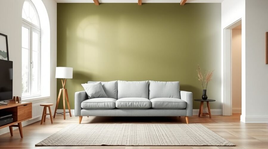
An accent wall is one wall that uses a different color, pattern, material, or texture from the surrounding surfaces to create a clear focal point. Done well, it can frame furniture, highlight architecture, add depth, or help define part of an open room. The best results come from choosing the wall deliberately and testing how the finish works with the room’s light, scale, and existing decor.
Quick Answer
An accent wall is a single wall designed to stand apart through paint, wallpaper, wood, tile, stone, or another finish. Choose a wall that already has a visual purpose—such as behind a bed, sofa, fireplace, or built-in—and coordinate its color and texture with the rest of the room rather than treating it as an isolated statement.
Key Takeaways
Key Takeaways
- An accent wall uses color, pattern, texture, or material to make one surface visually distinct.
- The best wall usually supports an existing focal point, architectural feature, or important piece of furniture.
- Color should be tested in the actual room because natural and artificial light can change how it appears.
- The 60-30-10 rule is a flexible color-proportion guide, not a requirement that an accent wall equal exactly 10% of the room.
- Accent walls still work in 2026, but full-room color, color drenching, statement ceilings, and large-scale art can be better choices when a single contrasting wall feels arbitrary.
What Is an Accent Wall?
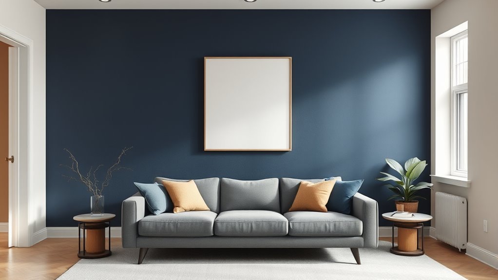
An accent wall, sometimes called a feature wall, is a wall intentionally finished differently from nearby walls. You can create one with contrasting paint, patterned wallpaper, wood paneling, plaster-style texture, stone veneer, tile, or another material.
Its main job is to establish a focal point. For example, an accent wall can emphasize a fireplace, built-in shelves, artwork, a headboard, or the wall behind a sofa. Benjamin Moore similarly recommends choosing an accent wall with a clear purpose and considering the room’s existing architecture, decor, and natural light.
That makes an accent wall more than a random splash of color. It can help organize what you notice first, visually define furniture placement, and introduce contrast without applying the same strong treatment throughout the entire room.
The strongest accent wall is not simply the boldest wall; it is the wall that has a clear visual job in the room.
How Accent Walls Change a Room
A well-placed accent wall changes where your eye goes first. It can emphasize a fireplace, artwork, bed, dining area, or architectural detail and make the room’s layout easier to read.
| Change | Typical Effect |
|---|---|
| Strong color | Creates a clear focal point |
| Rich texture | Adds depth and material contrast |
| Bold pattern | Adds movement and personality |
| Purposeful placement | Helps organize the visual layout |
| Coordinated palette | Connects the feature wall to the rest of the room |
Color can also affect the perceived proportions of a room. Sherwin-Williams notes that lighter colors can make compact spaces feel more open, while darker colors can make surfaces appear closer and larger rooms feel more intimate. These are useful tendencies rather than strict rules; lighting, undertone, furniture, ceiling height, and contrast all influence the final effect.
The popular 60-30-10 rule can help organize a palette: roughly 60% of the visual space uses a dominant color, 30% a supporting color, and 10% an accent. Treat those percentages as a starting point rather than exact measurements. Depending on its size and prominence, an accent wall may function as either the secondary color or part of the accent color.
How to Choose the Best Wall
Start by identifying where your eye naturally goes when you enter the room. A wall opposite a main entrance is often a good candidate, but the strongest choice may instead be the wall containing a fireplace, built-in shelves, artwork, a headboard, or another architectural feature.
Look for a surface with enough visual clarity to support the treatment. A wall does not have to be completely uninterrupted, but excessive doors, competing openings, or unrelated architectural features can make the accent feel fragmented.
Also check the view from adjoining spaces. In an open floor plan, a color that looks attractive when you stand directly in front of it may feel disconnected when viewed from a hallway, kitchen, or dining area.
Spot the Focal Wall
Ask what you want the accent wall to emphasize. If the answer is obvious—your bed, fireplace, built-ins, dining table, art, or a strong architectural detail—you probably have a useful focal wall.
Sherwin-Williams suggests that the wall visible opposite the main entrance is often an effective feature wall because it has immediate visual impact. That is a useful starting point, not a requirement. Architecture should take priority over a formula.
A wall with windows can also work when the windows are an important feature. Instead of automatically rejecting it, consider how the color interacts with daylight, trim, curtains, and the view outside.
Pro Tip: Stand in the doorway and take a photo of the room. The wall that already reads as the visual destination in the photo is often a stronger accent-wall candidate than a wall chosen only because it is empty.
Match Room Layout
Your accent wall should work with the room’s shape and furniture arrangement rather than creating an unrelated block of color.
- Use the wall to reinforce a natural focal point.
- Check how it looks from the room’s main entrance.
- Consider long sightlines from adjoining rooms.
- Avoid creating an arbitrary color break in the middle of an open architectural zone.
- Make sure large furniture does not hide the feature you are trying to emphasize.
In a narrow room, color placement can also affect perceived proportions. A darker treatment on a short end wall may visually bring that wall forward, while cooler or lighter tones can feel more recessive. Test the effect rather than relying on color theory alone.
Accent Wall Colors That Work Best
There is no single best accent wall color. The right choice depends on the existing wall color, permanent finishes, natural light, furnishings, and the mood you want.
A reliable approach is to pull a color from something that will remain in the room, such as a rug, artwork, upholstery, tile, wood tone, or curtain fabric. That makes the accent wall feel connected rather than added as an afterthought.
Another option is to use a lighter or darker version of the surrounding wall color. This produces contrast while keeping the palette closely related.
Best Color Matches
Some combinations are especially easy to coordinate because they connect color with common materials:
- Deep green can complement natural wood, linen, cream, and warm metal finishes.
- Navy can create strong contrast with warm whites, camel tones, and light woods.
- Charcoal can provide a restrained backdrop for artwork and lighter furniture.
- Terracotta can reinforce warm wood, leather, clay, and woven textures.
- Muted yellow, coral, or ochre can add energy when repeated in smaller accessories.
Use these combinations as inspiration rather than rules. Undertones matter: two colors may sound compatible by name yet look wrong together if one leans warm and the other strongly cool.
Light Vs. Dark Tones
Light accent colors can keep a room feeling open and are useful when the surrounding walls are medium or dark. Darker colors can add depth and create stronger contrast against light walls.
Do not assume a small room must avoid dark color. A deep wall can work beautifully when the room has appropriate lighting and the color supports the intended mood. What matters is how the entire composition works together.
Cooler colors often feel more recessive, while warmer hues may feel more visually advancing or intimate. Sheen, saturation, contrast, furnishings, and available light can change that effect.
Coordinate With Decor
Repeat part of the accent-wall color elsewhere in the room so the feature feels connected. You might echo it through pillows, artwork, a rug, a lamp, ceramics, curtains, or upholstery.
- Use warm undertones with other warm finishes when you want a cohesive glow.
- Use cooler hues when they complement existing stone, metal, fabric, or flooring.
- Choose complementary colors when you want stronger contrast.
- Repeat wood, stone, or textile tones to tie textured accent walls into the room.
- Use the 60-30-10 guideline loosely when you need help balancing visual proportions.
If the room already contains many patterns and strong colors, a quieter accent treatment may be enough. If the furnishings are restrained, the wall can carry more pattern, texture, or saturation.
Patterns, Wallpaper, and Texture Ideas
An accent wall does not need to rely on paint. Pattern and material can create a stronger focal point while keeping the color palette relatively restrained.
Wallpaper can introduce stripes, botanical prints, murals, geometric patterns, or subtle tonal texture. Peel-and-stick products may offer a less permanent option, but removability varies by product, paint condition, surface preparation, humidity, and how long the material remains installed.
Note: If you rent, test any removable wallpaper or adhesive product in an inconspicuous area first and follow the manufacturer’s surface and removal instructions. “Peel-and-stick” does not guarantee that every painted wall will remain unchanged.
Wood slats or paneling can add warmth and vertical rhythm. Stone or brick veneer brings stronger material texture, while tile can suit fireplaces, wet areas, kitchens, or other locations where the material makes architectural sense.
Keep scale in mind. A large graphic pattern can dominate a compact wall, while a very small repeat may become visually busy across a broad uninterrupted surface. The goal is to reinforce the focal point rather than compete with everything around it.
Paint Finish and Sheen Matter Too
Color gets most of the attention, but paint sheen also affects an accent wall. Flatter finishes reflect less direct light and can make saturated colors feel softer, while higher-sheen finishes reflect more light and may emphasize surface texture or imperfections.
Eggshell and similar low-sheen finishes are common choices for living spaces because they provide some durability without creating strong glare. A deliberate satin or gloss treatment can be effective on architectural details, paneling, trim, or decorative features when you want reflected light to become part of the design.
Before choosing a sheen, consider the wall condition. The more reflective the finish, the more likely dents, patches, waves, or uneven texture are to become visible under side lighting.
How Lighting Affects an Accent Wall
Lighting can substantially change how your accent wall looks. Natural light shifts throughout the day, and artificial light can push the same paint color warmer, cooler, brighter, or duller.
Benjamin Moore and Sherwin-Williams both recommend evaluating paint in the room where it will actually be used rather than relying only on a store chip or screen. Room orientation and the time of day can change how undertones appear.
- Watch the wall in morning, midday, and evening light.
- Check it with your normal lamps and overhead lighting switched on.
- Use directional lighting to emphasize textured materials when appropriate.
- Remember that glossy surfaces reflect more light than matte surfaces.
- Judge the sample beside trim, flooring, furniture, and other permanent finishes.
Warm artificial light may make some colors appear warmer, while cooler lighting can emphasize blue or gray undertones. The effect varies with the specific lamp, paint, and surroundings.
Test the Accent Wall Before You Commit
A small paint chip does not show enough surface area to predict how a color will feel across an entire wall. Test a larger sample in the actual room and view it beside the existing wall color, trim, flooring, and major furniture.
Check the sample at the times when you normally use the room. A color that looks balanced in bright afternoon daylight may appear much deeper under evening lamps.
Pro Tip: Compare at least two nearby shades or undertones instead of testing only one color. Side-by-side comparison makes it easier to notice when a shade is unexpectedly too warm, cool, gray, bright, or dark.
Accent Walls in Small Rooms and Open Floor Plans
In a small room, the goal is not automatically to choose the lightest possible accent. Instead, decide whether you want the feature wall to visually recede, feel cozy, or create a strong focal point. A deeper color may work well behind a headboard or desk even in a compact room when the rest of the palette supports it.
Open floor plans require more attention to sightlines. An accent wall may help define a dining nook, living zone, or work area, but the transition should correspond to a real architectural or functional boundary.
If the color stops at a location that has no relationship to the architecture or furniture layout, painting a larger connected area may create a more coherent result.
Accent Wall Dos for a Balanced Look
Use your accent wall to support something that already matters in the room. A fireplace, built-in, bed, sofa, dining table, collection, or piece of art gives the contrasting finish a reason to exist.
Connect the feature wall to the broader palette. You can repeat its color in smaller objects, use a deeper or lighter version of another room color, or choose a material that echoes the flooring or furniture.
Consider how the wall looks from more than one viewing position, especially in open-plan spaces. A successful feature should make sense from the doorway as well as from the main seating area.
Finally, sample the finish before committing. Lighting can reveal undertones and contrasts that are difficult to predict from a paint chip, online image, or wallpaper sample.
Accent Wall Don’ts to Avoid
Do not choose an accent wall solely because one wall happens to be empty. Without a focal point or architectural reason, a contrasting wall can look disconnected from the rest of the room.
Avoid choosing color in isolation. Flooring, trim, cabinets, countertops, upholstery, rugs, and daylight all influence how the wall will read.
Also avoid forcing several competing statements into the same area. A powerful wallpaper pattern, oversized artwork, dramatic shelving, saturated furniture, and a strongly contrasting wall can all demand attention at once.
Avoid Overpowering Colors
An accent wall should attract attention without making the rest of the room feel accidental. Extremely saturated color can work, but it needs enough visual support from the palette, lighting, and furnishings.
- Avoid colors that visibly fight the undertones in flooring, trim, or large furniture.
- Do not choose a color so similar to the surrounding walls that the difference looks unintentional.
- Test saturated colors at night as well as during daylight.
- Check the wall from adjoining spaces before painting the entire surface.
- Use contrast to reinforce the focal point rather than create a second competing one.
If a strong color feels disconnected, try a grayer, darker, lighter, or less saturated version rather than abandoning the color family completely.
Skip Busy Wall Features
Walls broken by many unrelated doors, vents, openings, shelves, or architectural interruptions can be harder to use as a clean feature wall.
That does not mean every wall with windows or built-ins is unsuitable. A fireplace, bookcase, or symmetrical window arrangement may actually make the wall a stronger focal point. The question is whether the features work together as one composition.
If you use patterned wallpaper or a highly textured treatment, give it enough open area to be read clearly. Too many accessories placed over a complex surface can make both the wall and the decor harder to appreciate.
Don’t Ignore Room Balance
Room balance depends on more than whether a wall is symmetrical. Consider the visual weight of furniture, windows, shelving, curtains, artwork, lighting, and adjacent colors.
- Support an existing focal point whenever possible.
- Check how natural light changes the accent throughout the day.
- Scale patterns to the size of the wall.
- Repeat at least part of the accent color or material elsewhere when the room needs stronger cohesion.
- Use full-room color instead if one contrasting wall creates an awkward visual break.
In both small and large rooms, proportion and context matter more than a rigid rule about which colors or walls are allowed.
Easy Accent Wall Alternatives
If you want a focal point without permanently changing one wall, several alternatives can provide similar visual impact.
A large piece of artwork can anchor a wall with color and scale. A gallery wall creates a broader composition, while a tapestry or textile panel adds softness and texture.
Peel-and-stick wallpaper or removable decals may provide a more temporary treatment when the product is compatible with the existing surface. Large decorative mirrors can reflect light and add visual depth, particularly in areas where a strong paint color would feel too heavy.
Decorative mirrors can redirect attention, reflect available light, and create a greater sense of depth without changing the wall color.
Other options include freestanding shelving, oversized headboards, large curtains, decorative screens, built-in cabinetry, color blocking, or a painted ceiling.
When Full-Room Color Works Better
Full-room color may work better when a single contrasting wall would interrupt rather than strengthen the architecture. Painting several connected walls—or extending color onto trim or the ceiling—can create a more continuous visual envelope.
- It can reduce abrupt color breaks.
- It can connect irregular architecture more smoothly.
- It can create an immersive or cocooning effect.
- It may suit rooms with no obvious single focal wall.
- It gives you more options for contrasting furniture, art, and textiles.
This approach is sometimes described as monochromatic decorating or, when color extends across multiple architectural surfaces, color drenching. It is an alternative to an accent wall rather than a universally better choice.
You can still use the 60-30-10 guideline with full-room color, but remember that it describes overall visual proportions. Walls may form much of the dominant 60%, while furniture and textiles carry secondary and accent colors.
Frequently Asked Questions
What Is the Rule for Accent Walls?
There is no universal rule requiring a particular wall or color. Start with a wall that has a clear purpose, such as highlighting a fireplace, headboard, artwork, built-in, or important sightline. Coordinate the treatment with the existing palette and test it in the room’s actual light. The 60-30-10 color guideline can help with proportions, but an accent wall is not automatically the 10% portion.
Are Accent Walls Out of Style in 2026?
Accent walls are not universally out of style in 2026. They remain useful when they emphasize genuine architecture, furniture, or a focal point. At the same time, many contemporary rooms use broader treatments such as full-room color, color drenching, statement ceilings, paneling, or large-scale artwork. Instead of following a trend rule, choose the treatment that best fits the room.
What Wall Should Be an Accent Wall in a Bedroom?
The wall behind the bed is often the easiest bedroom accent wall because the bed already acts as the room’s main focal point. However, another wall may be better if it contains a fireplace, built-in feature, striking window arrangement, or artwork. Check the view from the doorway and make sure the treatment works with your headboard, bedding, trim, and lighting.
What Is Replacing Accent Walls?
There is no single replacement. Alternatives include full-room color, color drenching, statement ceilings, large artwork, gallery walls, textured textiles, decorative paneling, built-in shelving, removable wallpaper, and color blocking. These treatments can create a focal point without relying on one contrasting painted wall.
Conclusion
An accent wall works best when it has a reason to be different. Use it to emphasize a bed, fireplace, artwork, built-ins, architecture, or another natural focal point rather than simply choosing an empty wall.
Coordinate the color or material with the rest of the room, consider sightlines and scale, and test paint under the lighting you actually use. Dark, light, patterned, and textured walls can all succeed when they fit the space.
If one contrasting wall feels forced, you have plenty of alternatives, including full-room color, paneling, wallpaper, artwork, textiles, color blocking, and ceiling treatments. The goal is not to follow an accent-wall rule; it is to make the room feel visually connected and purposeful.
Sources
- Benjamin Moore — Accent Wall Ideas & Inspiration — supports focal-wall selection, coordinating colors, room light, and accent-wall color guidance.
- Sherwin-Williams — Technique: Accent Walls — supports feature-wall selection, coordinated color choices, and basic accent-wall planning.
- Sherwin-Williams — How to Choose Paint Colors — supports guidance on room size, existing finishes, light sources, color flow, and testing paint in the room.
- Sherwin-Williams — How to Build a Color Palette — supports the 60-30-10 color-proportion guideline.
- Benjamin Moore — Color Handbook: Lighting and Paint Colors — supports guidance on how daylight and artificial light change perceived paint color.