
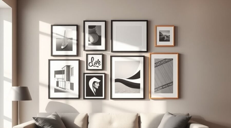
A gallery wall works best when it feels collected rather than crowded. Start by measuring the available wall, choosing a layout that fits the space, and identifying one or two pieces that can guide the arrangement. Then balance size, color, spacing, and personal objects while using hanging hardware that suits both the wall and the weight of each piece.
Quick Answer
To create a balanced gallery wall, plan the full arrangement before making holes, use one visual anchor, keep the gaps reasonably consistent, and hang the overall grouping near eye level. A center height around 57–60 inches is a useful starting point, but furniture, room scale, artwork size, and personal preference should guide the final placement.
Key Takeaways
- Measure the wall and test the entire arrangement on the floor or with paper templates before hanging anything.
- Use a large, meaningful, or visually strong piece as an anchor, then build around it.
- About 2–3 inches between many frames is a useful starting point, but larger pieces may need more breathing room.
- Treat roughly 57–60 inches to the visual center as a starting height, not an inflexible rule.
- Choose hanging hardware according to the wall material, frame hardware, and actual weight of the object.
- Mix photographs, prints, paintings, textiles, mirrors, and meaningful objects while repeating enough color or material to keep the display connected.
At a Glance
| Time Required | About 1–3 hours for planning and hanging a typical wall; longer for large or complex arrangements |
| Difficulty | Easy to moderate; heavier pieces and masonry walls may require more advanced installation |
| Tools Needed | Tape measure, pencil, level, painter’s tape or paper templates, and wall-appropriate hanging hardware; a stud finder may also help |
| Cost | Varies widely depending on whether you reuse existing art and frames or buy new framing, mounting hardware, and artwork |
Plan Your Gallery Wall Layout
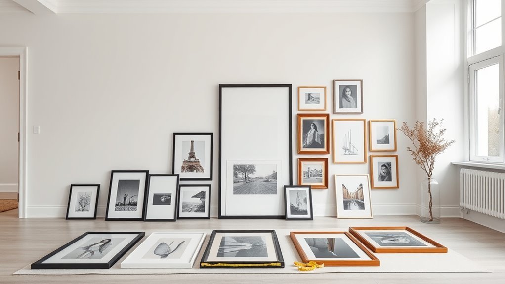
Start by measuring the usable wall space. Note windows, doors, light switches, furniture, molding, vents, and other features that may affect the arrangement.
Next, measure the outside dimensions of every frame or object. Lay the collection on the floor, or cut paper templates to size and tape them temporarily to the wall. This gives you a clear preview of scale, spacing, and balance before you make holes.
For many mixed gallery walls, 2–3 inches between neighboring pieces is a practical starting point. It is not a fixed rule. A large painting may need more breathing room, while a compact grid of small frames can often use tighter spacing. Current designer guidance commonly varies spacing according to the scale of the artwork rather than forcing every wall into one measurement.
Choose an anchor piece or anchor area and build outward. For the vertical position, think about the visual center of the entire grouping rather than trying to center every frame at exactly the same height.
A center height around 57–60 inches from the floor is a useful starting point for artwork, but it should be adjusted for nearby furniture, the size of the grouping, the room, and how people actually view the wall.
Try several arrangements and photograph each one. Looking at the versions side by side makes it easier to see which layout has the strongest proportions.
Pro Tip: Mark the outside edge of the entire proposed gallery wall with painter’s tape. If the taped rectangle looks too small, too high, or too wide from across the room, fix the overall scale before adjusting individual frames.
Choose a Gallery Wall Layout Style
You do not have to arrange every collection the same way. Pick a structure that suits both your art and the shape of the wall.
| Layout | Best For | Look |
|---|---|---|
| Organic or salon | Mixed sizes, art styles, and objects | Collected and relaxed |
| Grid | Similar frames or a photo series | Clean and structured |
| Linear | Hallways, consoles, and narrow walls | Simple and orderly |
| Picture ledge | Collections that change frequently | Flexible and layered |
A grid depends on accurate alignment and consistent spacing. An organic arrangement gives you more freedom, but it still needs visual balance. Ledges work well when you like to rotate art without creating new holes.
Choose a Cohesive Color Palette and Frame Styles
A gallery wall feels connected when something repeats across the collection. That could be color, frame material, subject matter, mat color, or even a consistent photographic tone.
If you want an easy starting point, choose two or three main colors that appear repeatedly in the artwork. You can also use mostly neutral frames and let the art provide the color.
Black, white, natural wood, metal, and painted finishes can all work together. You do not have to limit yourself to exactly three frame styles, but repeating a few finishes prevents a mixed collection from feeling random.
If the artwork is already colorful and visually busy, simpler frames can provide quiet structure. If the artwork is restrained, more varied frames can become part of the display itself.
Pick an Anchor Piece First
Your anchor piece is the artwork or object that gives the eye somewhere to start. It is often the largest piece, but it can also be the most colorful, meaningful, or visually distinctive one.
Place it near the visual center of the composition, or slightly off-center if you want a more organic layout. Then arrange medium and small pieces around it so the visual weight feels distributed rather than concentrated on one side.
The anchor does not need to sit at exactly 57 inches. Instead, use the approximate 57–60-inch center convention as a first check, then judge the whole arrangement in relation to furniture and the room.
A meaningful anchor also helps the collection feel personal. A favorite painting, family photograph, travel print, textile, or inherited object can set the tone for everything around it.
Mix Frame Sizes and Orientations
Different frame sizes create hierarchy. A large piece establishes focus, medium pieces connect areas of the composition, and small pieces add detail.
| Frame Choice | Design Effect |
|---|---|
| Large | Establishes focus |
| Medium | Connects clusters |
| Small | Adds detail and fills smaller gaps |
Mix horizontal and vertical pieces to keep an organic wall from becoming too rigid. You can also pair square, round, or irregular objects with rectangular frames.
You do not need perfect symmetry unless you are deliberately creating a grid. What matters is visual weight: if one side contains a very dark or large work, the opposite side may need several smaller pieces to balance it.
Step back frequently while planning. A layout that looks balanced from two feet away may feel lopsided from across the room.
Add Unframed Pieces and Unexpected Objects
A gallery wall does not have to be made entirely from framed prints. Textiles, canvases, mirrors, plates, hats, small sculptures, shadow boxes, and other meaningful objects can add shape and depth.
Use three-dimensional pieces selectively so they remain accents rather than turning the wall into visual clutter.
Use Unframed Art for Variety
Canvas art, textiles, fabric pieces, woven work, and other unframed items soften the straight edges created by traditional frames. Round and organic shapes are especially useful between rectangular pieces because they create visual pauses.
If an item is delicate, valuable, or difficult to clean, consider a suitable shadow box or professional framing rather than leaving it exposed.
Use Sculptural Accent Pieces
Small sculptural objects bring the wall forward into the room and can make the collection feel more personal.
| Object | Effect | Possible Placement |
|---|---|---|
| Ceramic piece | Adds dimension | On a properly mounted ledge |
| Vintage camera | Adds personality | Shadow box or secure shelf |
| Small sculpture | Creates a visual pause | Corner of a stable cluster |
Wood, metal, glass, ceramic, and fabric create stronger contrast than a wall made entirely from identical frame materials. Just make sure every object is supported by mounting hardware designed for its weight and shape.
Add Texture Beyond Frames
Textiles, macramé, fabric samples, woven work, and shallow shadow boxes can make a gallery wall feel warmer and less formal.
Mirrors add reflection and can break up large areas of paper art. Slim picture ledges create a flexible layer for frames that you want to rearrange more often.
Keep projecting objects out of busy walking paths, and make sure anything placed on a shelf or ledge is stable.
Match Hardware to the Wall and Artwork
Before hanging anything, identify three things: the wall material, the weight of the object, and the hanging hardware already attached to the frame.
Drywall, plaster, masonry, tile, wood, and other surfaces do not all accept the same fasteners. A lightweight frame may need only a suitable picture hanger, while a heavy painting or mirror may require a stud, an anchor rated for the load, or another wall-specific system.
The Smithsonian Museum Conservation Institute recommends using sturdy, appropriately sized hanging hardware and notes that wall studs provide maximum stability, while large or heavy paintings may need proper wall anchors.
If you use adhesive strips or adhesive-backed picture hangers, follow the exact product instructions for surface preparation, cure time, frame size, temperature, and weight. Command’s official instructions, for example, include specific surface and location restrictions and warn users to stay within the product’s intended use.
Warning: Do not choose a hanger by frame size alone. Weigh or reliably estimate the complete object, including the frame and glass, and use hardware designed for that wall material and load. For valuable, irreplaceable, very heavy, or unusually shaped pieces, professional installation is the safer option.
Hang the Gallery Wall at a Comfortable Viewing Height
“Eye level” is a useful concept, but it does not mean every picture should have its center at exactly the same measurement.
For a freestanding gallery wall, a common starting point is to place the visual center of the entire arrangement roughly 57–60 inches above the floor. Architectural Digest’s 2026 picture-hanging guide describes 57 inches as a broad starting rule while also emphasizing adjustment for the actual room and furniture.
Center the Whole Group, Not Every Frame
If the wall contains several pieces, treat them as one large composition. Find the overall top and bottom edges of your planned layout and estimate the visual midpoint between them.
That midpoint can start around the common eye-level range, but it may move higher or lower depending on the space.
| Situation | Placement Approach | Goal |
|---|---|---|
| Small artwork | Group with nearby pieces rather than floating it alone | Create enough visual presence |
| Large piece | Use it as the visual anchor | Establish hierarchy |
| Multiple pieces | Center the grouping as one unit | Keep the display connected |
Anchor the Gallery Wall With Furniture
When a gallery wall sits above a sofa, console, bed, or credenza, the furniture should influence the artwork more than an abstract floor measurement.
A gap of roughly 6–12 inches between the furniture and the lowest artwork is a common starting range. Larger furniture and taller accessories may call for a different gap.
- Measure the furniture width and height.
- Mark the centerline of the furniture.
- Position the gallery grouping so it visually relates to that centerline.
- Test the bottom gap with paper templates.
- Step back and check the relationship from the main viewing position.
If the gallery is too high, it can appear disconnected from the furniture below. If it is too low, it may feel cramped or become vulnerable to contact.
Balance Heights Visually
Mixed-size pieces do not need to line up along one horizontal line. Instead, look for repeated edges, balanced high and low points, and a clear overall shape.
Larger works often feel stable lower in the grouping, while smaller pieces can extend upward or outward. That is a design option, not a requirement.
Check the composition from several distances and angles. A gallery wall should work from across the room as well as close up.
Keep Spacing Consistent Without Making It Rigid
Consistent spacing is one of the simplest ways to make a gallery wall feel connected, but “consistent” does not mean every gap must be identical to the millimeter.
- Use about 2–3 inches as a starting gap for many mixed arrangements.
- Use tighter spacing for compact grids or very small frames when the proportions support it.
- Give oversized artwork more breathing room when needed.
- Use a ruler, spacer block, or tape measure when repeating the same gap.
- Check the negative space between groups as carefully as the frames themselves.
A small spacing difference is rarely a problem in an organic arrangement. What causes trouble is an unexplained large gap that visually separates one piece from the rest of the collection.
Hang the Gallery Wall Step by Step
Once the layout and hardware are settled, install the wall in a controlled order.
- Photograph the final floor layout. Keep the image nearby as your reference.
- Transfer the outline to the wall. Use paper templates or painter’s tape.
- Mark the anchor piece first. Measure from the top of the frame to the actual hanging point on the back.
- Install the appropriate hardware. Follow the manufacturer’s instructions for the wall material and load.
- Hang and level the anchor. Confirm its position before continuing.
- Work outward. Install neighboring pieces using your planned spacing.
- Check every few pieces. Step back instead of waiting until the entire wall is finished.
- Make small corrections. Straighten frames and adjust removable components before considering the wall complete.
When using wire-backed frames, remember that the wire rises when loaded. Measure the frame’s actual hanging position rather than assuming the nail should sit at the top edge.
Make the Gallery Wall Feel Personal
The most memorable gallery walls usually contain something that could not have been chosen from a generic frame set.
Mix family photographs with handmade art, travel finds, children’s drawings, prints, letters, maps, textiles, or work from artists you care about. These personal items give the display a story.
A repeated color, frame finish, mat style, or material can hold very different objects together. You do not need everything to match.
Think of the wall as a visual narrative. One area might represent family history, another travel, and another art you have collected simply because you love it.
Protect Art, Photographs, and Textiles
Placement should protect the object as well as improve the room.
The Smithsonian Museum Conservation Institute advises keeping paintings away from direct sunlight, heat sources, moisture, and large humidity changes. The Library of Congress also notes that light damage is cumulative and that sunlight is especially difficult to control for light-sensitive materials.
Original photographs, watercolors, textiles, works on paper, and other light-sensitive objects deserve extra care. If an irreplaceable original would receive strong daily sunlight, consider displaying a high-quality reproduction instead and storing the original appropriately.
Note: A visually perfect location is not always the safest location for valuable art. Direct sun, fireplaces, radiators, damp exterior walls, and areas exposed to water can shorten the life of sensitive materials.
Solve Common Gallery Wall Problems
If the layout feels wrong, diagnose the overall shape before moving random individual frames.
The Wall Feels Too Busy
Remove one or two competing pieces from the floor mockup and increase the negative space. You can also simplify the frames or limit the strongest colors to fewer locations.
The Gallery Wall Feels Too Small
Increase the footprint rather than merely spreading the same small frames farther apart. Add one larger piece, extend the arrangement vertically, or include a mirror, textile, or other object with more visual mass.
One Side Looks Heavier
Dark colors, thick frames, large artwork, and dense imagery create more visual weight. Balance a heavy piece with another substantial object or a cluster of smaller works on the opposite side.
The Frames Look Disconnected
Check the gaps. One oversized area of blank wall can break the composition into separate clusters. Bring those groups closer or add a bridging piece.
Frames Keep Going Crooked
Confirm that the hanging hardware is secure and level. For lightweight frames, small removable frame stabilizers or bumpers may help, provided they are appropriate for the wall and frame surface.
Paper templates remain one of the easiest ways to correct most layout problems before making additional holes.
Style a Gallery Wall Over Time
A gallery wall does not have to be completed in one weekend. Starting with a few strong pieces and leaving room to grow can make the collection feel more natural.
Add photographs, artwork, or mementos as you find pieces that matter to you. You can also rotate art, change frames, or move items as your taste changes.
Seasonal pieces can work when they fit the collection, although you do not need to rebuild the wall for every holiday. Picture ledges make frequent rotation easier because fewer permanent mounting points are required.
Photograph the arrangement before changing it. If a new version does not work, you will have a record of the previous layout.
Current 2026 design coverage continues to feature gallery walls while emphasizing personal collections, mixed materials, negative space, and displays that evolve over time rather than looking like a prepackaged matching set.
Frequently Asked Questions
What is the rule for gallery walls?
There is no single required rule. Plan the entire arrangement first, create a clear visual anchor, keep the spacing reasonably consistent, and treat roughly 57–60 inches to the visual center as a starting point rather than an exact requirement. Adjust the layout for the wall, furniture, artwork size, and viewing position.
Are gallery walls outdated in 2026?
No. Gallery walls are still widely used in 2026 design coverage. The look is evolving toward more personal collections, mixed media, meaningful objects, stronger negative space, and walls that grow gradually rather than matching frame sets purchased all at once.
What are common gallery wall mistakes?
Common mistakes include hanging before testing the layout, placing the whole arrangement too high, using unexplained large gaps, ignoring the wall type or frame weight, choosing too many unrelated pieces without a visual connection, and using weak hardware for heavy objects. Paper templates and a floor mockup prevent many of these problems.
What is replacing gallery walls?
Nothing has universally replaced gallery walls. Alternatives and related trends include picture ledges, one oversized statement artwork, memento walls filled with personal objects, textiles, mirrors, sculptural displays, and digital artwork. These options coexist with traditional gallery walls rather than making them obsolete.
How far apart should gallery wall frames be?
About 2–3 inches is a useful starting point for many mixed gallery walls. Smaller grid arrangements may look better with tighter gaps, while large artwork can need more space. Consistency and proportion matter more than following one exact measurement.
How high should a gallery wall be above a sofa?
A gap of roughly 6–12 inches between the top of the sofa and the lowest artwork is a useful starting range. The best position depends on the sofa height, artwork size, ceiling height, and the overall gallery-wall dimensions. The art should feel visually connected to the furniture rather than floating far above it.
Can you make a gallery wall without nails?
Sometimes. Adhesive picture-hanging products can work for compatible frames, wall surfaces, sizes, and weights. Follow the manufacturer’s preparation, weight-limit, curing-time, and location instructions exactly. Heavy, valuable, or irreplaceable items may require mechanical hardware or professional installation instead.
Conclusion
A successful gallery wall combines planning with personality. Measure the space, test the layout before hanging, choose a strong anchor, and use spacing that suits the scale of your collection. Treat familiar measurements such as 57 inches and 2–3-inch gaps as starting points rather than rigid rules.
Most importantly, match the hanging hardware to the wall and the weight of each object, protect valuable artwork from damaging light and heat, and give yourself permission to change the collection over time. The result should feel connected to the room and meaningful to you—not simply perfect on a measuring tape.
Sources
- Smithsonian Museum Conservation Institute — Caring for Your Paintings — hanging hardware, studs, anchors, heat, moisture, humidity, and sunlight guidance.
- Library of Congress — Limiting Light Damage — light exposure and preservation guidance for sensitive materials.
- 3M Command — Picture Hanging Instructions — manufacturer guidance on application, surfaces, restrictions, and safe product use.
- Architectural Digest — Expert Guide to Hanging Pictures — current 2026 guidance on wall type, artwork weight, planning, and the 57-inch starting convention.
- House Beautiful — How to Style a Gallery Wall — current 2026 designer guidance on spacing, negative space, mixed materials, personal curation, and evolving displays.


