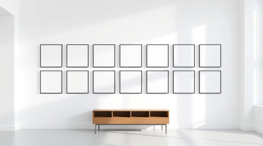
To space frames on a gallery wall for a clean grid, plan the whole arrangement before making any holes. A consistent 2–3 inch edge-to-edge gap is a strong starting point for matching frames, but the more important rule is consistency. Treat the full gallery as one visual unit, center that unit at a comfortable viewing height, and adjust the final position for furniture and room proportions.
Quick Answer
For a clean gallery-wall grid, use equal-size frames, keep the edge-to-edge gap consistent—2 to 3 inches is a dependable starting point—and treat the entire arrangement as one unit. Center the grouping around eye level, roughly 57 to 60 inches from the floor, then adjust for nearby furniture and room proportions.
Key Takeaways
- Use matching frame sizes and equal gaps when you want a true grid.
- Start with 2–3 inches between frame edges; consistency matters more than changing the gap by frame count.
- Measure the center of the whole grouping at roughly 57–60 inches from the floor—not the top row.
- Use paper templates to test scale, furniture clearance, and spacing before installing hardware.
- Choose hanging hardware for the frame weight and wall material, and follow the hardware maker’s limits.
At a Glance
| Time Required | About 30–90 minutes for a small 4–6 frame grid, depending on wall material and hardware |
| Difficulty | Easy to moderate; precision matters more than strength |
| Tools Needed | Tape measure, pencil, level, paper, painter’s tape, and wall-appropriate hanging hardware; hammer or drill if required |
| Cost | Usually low if you already own the frames and tools; the main added cost is suitable hanging hardware |
Choose a Gallery Wall Layout
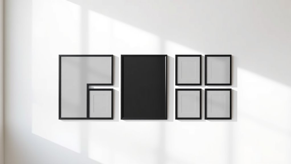
Start by choosing a layout that gives your gallery wall structure. For a clean grid, matching frame sizes in straight rows and columns create the most predictable alignment.
Before measuring nail locations, use painter’s tape or paper templates to test the overall footprint on the wall. Check how the grouping relates to nearby furniture, doorways, lamps, switches, and the amount of blank wall around it.
If the gallery sits above furniture, a useful scale guideline is for the artwork grouping to span about two-thirds of the furniture width. Pottery Barn’s hanging guide uses this two-thirds proportion as a starting point rather than a strict rule.
For a true grid, you do not need one oversized “anchor” frame. Instead, use matching dimensions and repeat the same horizontal and vertical gaps. If you are building a mixed-size gallery rather than a grid, then a larger or more visually dominant piece can act as the anchor.
Use 2–3 Inches of Space Between Frames
Keep the edge-to-edge gap consistent throughout the grid. A 2–3 inch gap is a well-established starting point: Framebridge recommends 2–3 inches for grid galleries, while Pottery Barn also advises a few inches between grouped pieces.
| Frame count | Recommended starting gap |
|---|---|
| 4 frames | 2–3 in |
| 5 frames | 2–3 in |
| 6 frames | 2–3 in |
| 7 pieces | 2–3 in |
| Mixed sizes | Keep one consistent visual gap |
The frame count itself does not require a different gap. If your frames are very small, 2 inches may look more connected; if they are large, 3 inches may breathe better. The visual goal is an even rhythm from one frame to the next.
Leave enough blank wall around the outside of the grouping that the gallery does not look squeezed against corners, trim, furniture edges, or adjacent decor. There is no universal rule that the outer margin must equal exactly twice the internal gap, so judge the outside space by the room rather than a fixed formula.
Pro Tip: Cut one spacer block from scrap cardboard at your chosen gap—such as 2.5 inches—and use that same spacer between every paper template. It is faster and more repeatable than re-measuring each gap.
Calculate the Grid Size Before Hanging
Before you mark the wall, calculate the finished width and height of the entire grid. This tells you where the outside edges will land and makes centering much easier.
Total grid width = (frame width × number of columns) + (gap × spaces between columns).
Total grid height = (frame height × number of rows) + (gap × spaces between rows).
For example, three 12-inch-wide frames with two 2.5-inch gaps create a total width of 41 inches: 36 inches of frame width plus 5 inches of spacing. Two 12-inch-high rows with one 2.5-inch gap create a total height of 26.5 inches.
Mark the wall centerline first, then place half of the total grid width on each side of that line. This prevents a common mistake: centering the first frame instead of centering the finished arrangement.
Center the Gallery Wall at Eye Level
The original 57-inch idea is useful only when it refers to the center of the artwork or the full grouping. It should not be used as the height of the top row. Framebridge uses about 57 inches to the center of a gallery wall on a blank wall, while Pottery Barn uses roughly 60 inches to the center.
Use 57–60 inches as a starting center height, then adjust for your room, furniture, ceiling height, and the size of the gallery. The grouping should feel connected to what is below it rather than floating too high.
Find the Grouping Center
Measure the wall or the furniture below it, then mark the horizontal midpoint. That point is the centerline for the full gallery—not automatically the center of one particular frame.
- Calculate the total grid width and height.
- Mark the horizontal center of the available wall area or the furniture below.
- Choose a center height around 57–60 inches from the floor as a starting point.
- Use half the grid height to determine the top and bottom edges of the full arrangement.
If the gallery hangs above a sofa, console, headboard, or other furniture, the furniture relationship can matter more than the generic eye-level number. Pottery Barn suggests about 4–6 inches between furniture and the bottom of the artwork, while Framebridge commonly uses 7–10 inches. Treat those as design starting points, not a building standard.
Use 57–60 Inches as a Starting Center Height
On a blank wall, place the center of the entire grid around 57–60 inches from the floor, then step back and check the result. Do not align the tops of all frames at 57 inches.
If the calculated bottom of the grid crowds furniture, raise the grouping enough to create breathing room. If the grouping feels disconnected from a low console or sofa, lower it while keeping the composition visually balanced.
Use a level to establish a horizontal reference line and check each row as you work. Small errors compound across a multi-frame grid, so verify both height and spacing before installing the next hanger.
Note: “Eye level” is a design guideline, not a fixed code requirement. In a seated room, over tall furniture, or on a very high wall, the best-looking center may be outside the 57–60 inch range.
Choose Hardware for the Wall and Frame
Before marking nail centers, identify the wall material and weigh the frame if its weight is not known. Use hardware that is specifically rated for both the wall surface and the load.
For example, 3M CLAW drywall picture hangers are sold in specific weight ratings and are intended for drywall. That does not make them suitable for brick, concrete, plaster, tile, or every other wall type. Follow the instructions and limits for the exact hanger you use.
Also check the frame hardware. A sawtooth hanger, D-rings, hanging wire, and corner brackets all place the wall fastener at different heights. Measuring the frame edge alone will not tell you where the nail or hook belongs.
Warning: Do not choose a fastener only by convenience. Match the hanger to the wall material and frame weight, follow the manufacturer’s load rating, and follow the manufacturer’s installation instructions for the fastener and wall surface.
Use a Paper Template for Exact Placement
Trace each frame’s outline onto paper so you can match the actual dimensions and spacing before you make holes. A full-size paper mockup is especially helpful for a grid because you can check the outer footprint as well as the internal gaps.
Mark the hanger location on each template, not just the template center. Then tape the paper shapes to the wall with painter’s tape so you can shift them until the whole grid is level, centered, and correctly spaced.
Trace Frame Outlines
Place each frame on kraft paper, wrapping paper, or another large sheet and trace its outline. For identical frames, you can make one accurate template and duplicate it, but label templates if the frames use different hanging hardware.
- Cut each paper shape cleanly.
- Label the template with the matching frame or artwork.
- Mark the top edge so you do not accidentally rotate the template.
- Lay the templates out with the same 2–3 inch spacing you plan to use on the wall.
This lets you test the composition before committing to holes and makes it much easier to preserve a straight, repeatable grid.
Mark Nail Centers
Turn each frame over and measure from the top edge of the frame down to the point where the wall hook must engage the frame hardware. For a hanging wire, pull the wire upward as it will sit under load and measure to the top of that tensioned point. Framebridge’s wire-hanging method uses this same top-edge-to-wire measurement.
Transfer that measurement to the matching paper template. If a frame has two D-rings or two brackets, measure the horizontal distance between them and mark both positions accurately.
Once the paper layout is correct, mark the hanger points through the paper. This separates two jobs—designing the grid and locating the hardware—so a good visual layout is less likely to be ruined by measurement drift.
Tape Templates to Wall
Tape the full-size templates to the wall in your planned arrangement and check the true scale from several feet away.
- Keep the same chosen gap between every adjacent template.
- Check the outside edges against your calculated total grid width and height.
- Use a level to verify each row and column.
- Step back, adjust anything that looks too high, low, tight, or isolated, and photograph the layout for reference.
Only after the paper layout looks right should you transfer the hardware marks to the wall.
Hang the Second Row Straight
After the first row is secure and level, use it as a reference for the second row. Measure the frame-edge gap rather than the distance between nails, because different hanger positions can change the nail-to-nail measurement even when the visible gap is correct.
| Checkpoint | Target | Why it matters |
|---|---|---|
| Row gap | Same chosen gap, usually 2–3 in | Preserves rhythm |
| Hook spacing | Match each frame’s hardware | Keeps frames stable |
| Furniture clearance | Keep a comfortable visual gap | Prevents crowding |
| Alignment | Level horizontal and vertical lines | Unifies the grid |
| Final scan | Step back after each few frames | Catches drift early |
If a frame uses two hooks, measure between them before setting the fasteners and confirm that both marks are level. After hanging each piece, recheck the visible frame edges rather than assuming the hardware position guarantees a straight row.
Adjust Gaps Before You Hang
Before installing permanent hardware, use the paper templates and painter’s tape to fine-tune the layout. Measure the internal gaps at several points, because a frame can look almost level while still creating a wider gap at one end.
- Mark each frame edge with the full-size template.
- Measure the internal gaps twice.
- Check the total grid width and height against your calculations.
- Step back and check the relationship to furniture and surrounding blank wall.
If the arrangement feels crowded, either reduce the overall number of frames, reduce the frame size, or increase the outer breathing room. Do not force a grid into a wall area that is too narrow for the calculated footprint.
Consistent negative space matters more than an arbitrary “outer margin equals twice the inner gap” rule. Use the wall boundaries and nearby furniture as the final visual check.
Troubleshoot Gallery Wall Alignment
If the finished grid looks off, diagnose the pattern before moving every frame.
- One frame sits low: recheck the top-edge-to-hanger measurement for that frame. Its wire, D-ring, or hook may sit differently from the others.
- The row slopes: verify the first and last frame with a level, then check the intermediate marks against the same reference line.
- Gaps vary: measure edge to edge, not nail to nail. Use one spacer block between frames.
- The whole grid looks too high: measure the center of the entire grouping, not the top row, and compare it with the room and furniture below.
- Frames keep rotating: confirm that two-point hardware is level or use a manufacturer-approved stabilizing method appropriate for the frame and wall.
Finish With a Balanced Gallery Wall
To finish a gallery wall with a balanced look, keep the spacing between frames consistent and judge the arrangement as one unit. Matching frames create the crispest grid, while a mixed gallery needs more visual balancing from piece to piece.
On a blank wall, start with the grouping center around 57–60 inches from the floor. Above furniture, also check the bottom clearance and the gallery’s overall width. If the arrangement spans about two-thirds of the furniture width and sits comfortably above it, the result will usually feel connected rather than undersized or floating.
| Check | Target | Result |
|---|---|---|
| Spacing | Consistent; usually 2–3 in | Even rhythm |
| Center | About 57–60 in on a blank wall | Comfortable viewing height |
| Frames | Matching for a strict grid | Unified geometry |
| Width | About 2/3 of furniture as a starting point | Proportional scale |
| Hardware | Rated for wall type and load | More secure installation |
That final pass locks in the alignment, spacing, and scale so the gallery reads as one polished composition instead of a group of separate frames.
Frequently Asked Questions
What are common gallery wall mistakes?
Common mistakes include changing the gap from frame to frame, centering one frame instead of the whole grouping, using the 57-inch guideline for the top row instead of the gallery center, skipping a paper mockup, and choosing wall hardware without checking the wall type or frame weight.
How do you arrange frames for a clean gallery wall grid?
Use matching frame sizes, calculate the finished grid width and height, choose one consistent gap—often 2–3 inches—and center the entire grouping on the available wall area. Test the full layout with paper templates, mark the actual hanger positions, then install and level one row at a time.
What is the 2/3 rule for wall art?
The two-thirds rule is a design guideline that says artwork above furniture can look proportional when the artwork or grouping spans about two-thirds of the furniture width. For example, a grouping around 40 inches wide is a reasonable starting point above a 60-inch-wide console or sofa section. Adjust for the actual room and furniture.
How high should a gallery wall be above a sofa or console?
There is no single mandatory distance. Pottery Barn suggests roughly 4–6 inches between the furniture and the bottom of the artwork, while Framebridge often suggests 7–10 inches. Use those as starting ranges and choose the height that keeps the gallery visually connected to the furniture without crowding it.
Are gallery walls out of style in 2026?
There is no objective design standard that makes gallery walls “out of style.” A clean grid remains a practical way to display a coordinated set of art or photos, while more relaxed arrangements, picture ledges, and collected displays are also used. Choose the format that suits the room and the pieces you want to show.
Sources
- Pottery Barn — How to Hang Artwork — supports center-height, spacing, furniture-clearance, and two-thirds-width design guidance.
- Pottery Barn — Wall Art Guide — supports 2–3 inch spacing and consistent framing for cohesive wall displays.
- Framebridge — How to Build a Grid Gallery Wall — supports matching frames and consistent 2–3 inch grid spacing.
- Framebridge — How to Hang a Gallery Wall — supports treating the layout as one unit and using about 57 inches to the grouping center on a blank wall.
- Framebridge — How to Hang Art With a Hanging Wire — supports measuring the wire-to-frame-top offset before placing the hook.
- 3M — CLAW Drywall Picture Hangers — supports matching drywall hanging hardware to stated weight ratings and intended wall use.
Conclusion
With the layout planned and the templates in place, you can hang each frame with much more confidence. Keep the internal gaps consistent, center the whole gallery rather than the top row, and let the room determine the final outer margins. Like notes on a staff, each frame should sit in a steady rhythm. Step back, fine-tune the alignment, and the grid will read as one calm, polished composition.