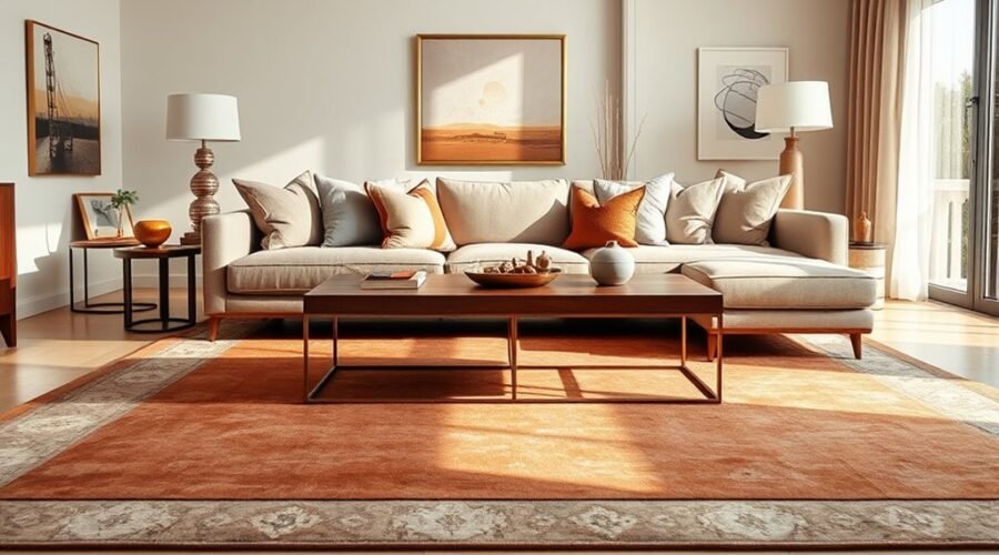
Choosing the right rug color starts with the mood you want your living room to have, then narrows down through your walls, sofa, flooring, lighting, and everyday use. A rug does not have to match every surface. It should coordinate with the room while creating enough contrast to keep the seating area clear, balanced, and visually connected.
Quick Answer
The best rug color for a living room coordinates with the sofa, walls, and floor without matching them exactly. Use warm earthy shades for a cozier look, blues and greens for a cooler feel, or a patterned mid-tone rug for busy rooms. Always test the color in your actual lighting before buying.
Key Takeaways
- Match the rug to the mood you want: warm earth tones feel cozy, while soft blues, greens, and muted neutrals tend to feel calmer.
- Echo colors already found in the walls, sofa, artwork, or curtains instead of choosing an exact match.
- Use contrast strategically: a darker or richer rug can define light furniture, while a lighter rug can relieve a visually heavy room.
- Check undertones, flooring, texture, and lighting, because all four change how a rug color appears.
- For high-traffic rooms, medium to medium-dark multitone patterns generally disguise everyday soil better than very pale or extremely dark solid colors.
How to Choose a Living Room Rug Color
A simple way to narrow your choices is to work from the largest fixed surfaces toward the smallest accents. This prevents the rug from looking disconnected after it arrives.
- Identify the room’s undertone. Decide whether the walls, flooring, and largest furniture pieces lean warm, cool, or neutral.
- Choose the mood. Decide whether you want the room to feel cozy, airy, calm, dramatic, colorful, or understated.
- Pick a relationship. The rug can coordinate with the sofa, contrast with it, or repeat one smaller accent color from artwork, curtains, or pillows.
- Account for use. A formal low-traffic living room can handle lighter solids more easily than a room used daily by children, pets, or guests.
- Test before committing. View a sample in morning daylight, afternoon light, and your normal evening lamps.
Pro Tip: Put the rug sample directly beside the sofa and on the floor rather than holding it upright. A color can look very different horizontally, where it receives light and shadows differently from a wall sample.
Choose Rug Color by Room Mood
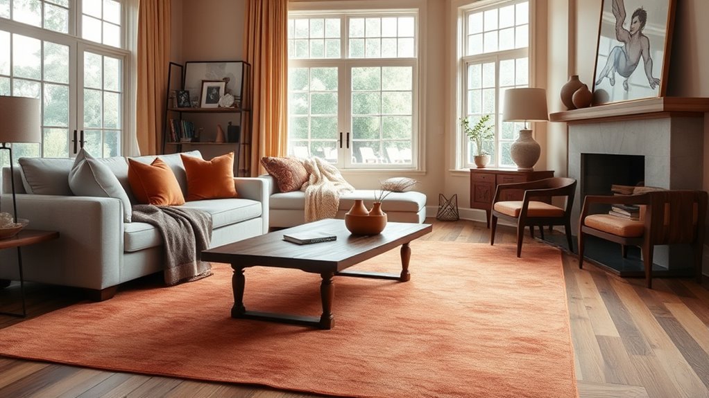
To set the right mood in your living room, choose a rug color that reflects how you want the space to feel.
If you want a cozy retreat, tonal earthy shades such as warm beige, camel, rust, terracotta, and brown can add visual warmth and depth.
For a calm, restrained setting, muted blues, greens, blue-grays, and soft neutrals can create a quieter palette.
If you prefer a more expressive room, stronger reds, mustard yellows, emeralds, or saturated multicolor patterns can turn the rug into a focal point.
These effects are design associations rather than rigid psychological rules. Personal preference, culture, light, and surrounding colors all influence how a hue feels in a particular room.
As you narrow the options, ask whether the rug feels warm, quiet, energetic, formal, or relaxed beside the furniture you already own.
Match Rug Color to Walls and Sofa
You will usually get a more layered look when the rug coordinates with the walls and sofa without copying them exactly. Repeating an undertone or accent color can create cohesion, while a controlled difference in value keeps the furniture from visually disappearing into the floor.
For example, a cream sofa does not require a cream rug. A rust-and-beige pattern, muted olive, medium blue, or charcoal-and-ivory design could all work depending on the walls, flooring, and mood.
Wall Color Harmony
Start by identifying the wall’s undertone. Crisp white, creamy white, warm greige, cool gray, blue, green, and saturated colors all react differently beside a rug.
If your walls are crisp white, a stronger rug color can add contrast, while a soft neutral creates a quieter, more tonal room. In a gray-walled room, warm shades such as muted terracotta, ochre, camel, or warm beige can offset a cool cast if that is the balance you want.
Do not judge undertones from a product photo alone. Sherwin-Williams explains that both natural and artificial lighting can emphasize different undertones, so the same color can read differently throughout the day.
Sofa Contrast Balance
A rug should usually differ from the sofa enough that the two surfaces remain distinct. That does not mean the contrast has to be dramatic.
With a white or cream sofa, you can use rich color for energy, a medium neutral for a relaxed transition, or a patterned rug that combines light and dark tones. With a charcoal or navy sofa, a lighter rug can brighten the seating group, while a medium earthy rug can soften the contrast.
If the sofa is already patterned, choose a rug with a quieter pattern or simpler palette. If the sofa is solid, you have more freedom to use pattern on the floor.
Undertones and Texture
Beyond basic color contrast, the undertones in your walls, sofa, wood, and flooring shape how a rug reads. Warm and cool colors can either harmonize or intentionally balance one another; they do not have to stay in separate groups.
Texture also changes perceived color. A flatweave usually reads more evenly, while high-low, tufted, looped, or heathered surfaces create tiny highlights and shadows that can make the same color look more varied.
Before buying, check:
- wall undertones
- sofa color and fabric texture
- floor color
- rug pile and pattern
- daylight and evening lighting
Neutral rugs can shift noticeably under different light, so a physical swatch or sample is more reliable than a screen image.
Match the Rug Color to Your Flooring
The floor is one of the largest color surfaces in the room, yet it is easy to overlook when shopping for a rug.
With light oak or pale wood floors, medium earthy tones, soft greens, faded blues, warm grays, and darker patterned rugs can provide definition. On dark wood floors, ivory, sand, beige, muted color, or a pattern with lighter areas can keep the rug from disappearing.
For gray flooring, first decide whether the gray leans blue, green, violet, or warm greige. You can repeat that undertone for a quiet scheme or introduce controlled warmth with camel, rust, muted mustard, or warm beige.
On tile or stone, look at the veining and secondary colors rather than only the main surface color. A rug that repeats a minor warm or cool note often looks more connected than one chosen from the dominant color alone.
If the living room is already carpeted, make the area rug visibly different in either value, pattern, or texture so it looks intentional rather than like an accidental second layer.
Use Contrast to Define the Space
Contrast helps a rug define the seating area instead of disappearing into the surrounding finishes. It can come from light versus dark, warm versus cool, solid versus pattern, or smooth versus textured surfaces.
The goal is not maximum contrast. It is enough separation for the rug, sofa, and floor to read as distinct layers.
Contrast With Walls
A darker rug against light walls can visually anchor a room, while a lighter rug in a dark room can reduce some of the visual weight near the floor.
For a softer transition, choose neighboring neutrals or a pattern that contains both the wall color and one contrasting shade.
A bold pattern can also break up large solid surfaces and become the room’s focal point. If the walls, curtains, and upholstery already contain several strong patterns, a quieter rug is usually easier to balance.
Differentiate Furniture Tones
Once the rug works with the walls, look at the furniture tones it needs to support. A light sofa over an equally light solid rug can work in a tonal room, but subtle differences in texture or undertone become especially important.
If the furniture is deep-toned, a lighter or medium rug can add separation. If the seating is pale, a medium or darker rug can create a stronger base.
Rug size matters too. Rather than treating a fixed border of bare floor as mandatory, size the rug to the furniture group. IKEA’s current rug-size guidance recommends choosing a living-room rug that extends beyond the sofa and allows the sofa to sit fully or partly on the rug; for a medium rug, having roughly one-third of the sofa on it can work well.
Add Visual Depth
A room feels more layered when its major surfaces are related without being identical. Try one or more of these approaches:
- Pair a bold rug with simple upholstery.
- Use a contrasting rug to define an open-plan seating zone.
- Repeat one rug color in pillows, art, pottery, or curtains.
- Use a lighter and darker version of the same color family for a softer tonal scheme.
The popular 60-30-10 decorating idea can be useful as loose shorthand for dominant, secondary, and accent colors, but it is not a technical rule. Adjust the proportions to suit the room instead of forcing every space into the same formula.
Pick Warm Rugs for Cool Living Rooms
If your living room contains a lot of cool gray, blue, chrome, or cool-toned flooring, a warm rug can soften the palette and make the seating area feel less stark.
Terracotta, rust, camel, warm beige, mushroom, and muted ochre can provide that contrast without requiring you to replace the existing furniture.
A patterned rug that combines warm accents with some of the room’s existing cool colors is often easier to integrate than a single saturated warm color.
You can also stay completely cool-toned if that is the effect you prefer. Warm-versus-cool balance is a design choice, not a rule that every room must follow.
Choose Rug Color for Room Size and Light
Light changes color perception, so a rug that looks pale beige in a bright showroom may appear deeper or grayer in a north-facing or dim living room.
In a small or low-light room, light to medium colors can keep the floor from feeling visually heavy, especially when the walls and furniture are also dark. That does not mean dark rugs are forbidden; a dark rug can look striking when the room has enough contrast and intentional lighting.
In a large, bright room, richer or darker colors can help define a seating group and keep furniture from feeling visually scattered.
East- and west-facing rooms can change dramatically throughout the day. Sherwin-Williams notes that room orientation and artificial lighting alter how colors and undertones appear, which is why testing a sample at the times you use the room most is worthwhile.
Note: Online product photography is useful for narrowing choices, but screen brightness, editing, daylight, and bulb temperature can all affect perceived color. Treat an in-room sample as the final check.
Best Rug Colors for Every Living Room Style
The best rug color depends partly on the style you are building and the finishes already in the room.
- Modern or minimalist: warm gray, greige, ivory, sand, charcoal, muted green, and restrained two-tone patterns work well when you want visual simplicity.
- Bohemian: rust, ochre, olive, burgundy, faded blue, and multicolor vintage-inspired designs can support a layered, collected look.
- Traditional: navy, burgundy, forest green, camel, red, and softly aged multicolor patterns can add classic depth.
- Scandinavian: ivory, oatmeal, beige, light gray, natural wool tones, and quiet blue or green accents preserve an airy palette.
- Eclectic: nearly any color can work if at least one rug tone is repeated elsewhere in the room.
- Organic or earthy: sand, clay, mushroom, olive, brown, cream, and undyed-looking neutrals complement wood and natural textures.
Instead of choosing a rug because it belongs to a named style, use the style category as a starting point and check it against your actual walls, sofa, floor, and lighting.
How Do Rug Patterns Change the Look?
Once you have narrowed the color family, pattern determines how quiet or visually active the rug feels.
A subtle tonal motif can add texture without competing with artwork or furniture. A bold geometric, floral, abstract, or traditional pattern can become the focal point when the rest of the room is relatively simple.
Pattern scale matters as much as color. Large motifs generally read more clearly from across the room, while tiny high-contrast patterns create more visual movement.
Patterns also have a practical advantage: they can disguise small crumbs, lint, minor spots, and uneven wear more effectively than an extremely uniform solid.
Which Rug Colors Work in White Rooms?
In a white room, the rug can either preserve the clean backdrop or provide the main dose of color.
Merlot, olive, navy, rust, forest green, and multicolor patterns can bring stronger contrast. Mist, ivory, oatmeal, beige, and pale gray create a quieter transition, while terracotta, camel, and brown add warmth.
- Use vivid or deeper hues for energy and contrast.
- Use pale neutrals for a calm, tonal look.
- Use earthy shades for warmth.
- Use a patterned rug when you want both color and practical camouflage.
White walls are flexible, so the sofa and flooring often become the more important constraints. A rug that looks beautiful against white paint can still clash with a strongly warm wood floor or a cool gray sofa if the undertones are ignored.
What Rug Colors Hide Wear Best?
If you want a rug that keeps looking presentable between cleanings, do not assume the darkest solid color is automatically best.
The Carpet and Rug Institute notes that multicolor construction can help hide soil and stains, and published carpet-cleaning research has found that medium to medium-dark colors in random patterns can conceal visible soil effectively. Very pale and extremely dark solid surfaces can both make certain debris more noticeable.
For an active living room, consider:
- medium or medium-dark multitone rugs
- heathered or mottled finishes
- vintage-inspired or lightly distressed patterns
- small-to-medium patterns with more than one color
- colors similar to the dust, pet hair, or debris most common in your home
Construction matters too. Low-pile and flatwoven rugs can be easier to vacuum in many everyday settings, while thick or shaggy piles may require more careful vacuum technique.
Color does not replace maintenance. The Carpet and Rug Institute’s rug-care guidance recommends regular vacuuming and prompt treatment of spots and spills, following the rug manufacturer’s care instructions.
Choose Rug Colors for Pets, Kids, and High Traffic
For a busy family room, practical color selection can make daily upkeep less frustrating.
If you have a light-shedding pet, a black rug may show every hair. With a dark-haired pet, a bright ivory rug can create the opposite problem. A mixed medium-value pattern is often more forgiving than either extreme.
With children or frequent food and drink in the room, consider patterns that include several neighboring colors rather than one perfectly uniform pale shade. Rust, taupe, olive, denim blue, camel, and medium gray can be practical depending on the rest of the room.
Always check the manufacturer’s cleaning instructions before assuming a particular material or construction is washable or stain resistant.
Which Rug Colors Tie the Room Together?
To tie your living room together, choose a rug color that relates to finishes already in the space. Pull one or two tones from the sofa, walls, drapery, artwork, wood, or accessories rather than trying to match every item.
A rug does not need to match the room. It needs enough shared color, undertone, or contrast to make the major surfaces feel connected.
A useful approach is:
- Let the walls or largest fixed surfaces establish the broad palette.
- Use the sofa and large furniture as the secondary layer.
- Choose a rug that repeats one existing tone and introduces one controlled contrast.
- Repeat a rug color once or twice in smaller accessories if the room needs more cohesion.
In a large bright room, a deeper rug can define the seating area. In a compact room, a light or medium rug can keep the floor visually quieter. Neither approach is mandatory; the surrounding contrast matters more than a single color rule.
How to Test a Rug Color Before Buying
A rug is large enough to change the balance of an entire room, so test the choice whenever samples are available.
- Place the sample flat on the actual floor.
- Move it beside the sofa and other large upholstered pieces.
- Look at it in morning, midday, and evening light.
- Turn on the lamps and overhead lights you normally use.
- Photograph it from across the room to judge the overall balance.
- Compare your final two or three choices side by side rather than relying on memory.
If a retailer does not provide samples, confirm the return policy before buying a large rug based only on an online image.
Frequently Asked Questions
Should My Rug Be Lighter or Darker Than My Couch?
Either can work. A darker rug can create stronger definition under a pale sofa, while a lighter rug can relieve the visual weight of dark seating. For a softer look, keep the rug and sofa closer in value but vary their texture or pattern. Check undertones so the combination looks deliberate in your room’s lighting.
What Are the Trends for Living Room Rugs in 2026?
There is no single official 2026 rug trend. Current collections and design-market coverage show several directions at once, including warm earthy shades, tactile and high-low textures, vintage or heritage-inspired designs, grids and other graphic patterns, and quieter natural neutrals. The Loloi 2026–2027 catalog, for example, contains a broad mix rather than one dominant look. Choose a trend only when it fits the room and your long-term taste.
What Is the Rule for Rugs in a Living Room?
There is no single mandatory layout rule. A reliable starting point is to choose a rug wide enough to visually connect the seating group and long enough to extend beyond the sofa. The sofa may sit fully on the rug or partly on it; with a medium rug, placing the front portion of the sofa on the rug can create a connected arrangement. Measure the actual furniture layout before buying.
How Do You Match Rugs in Adjoining Rooms?
Use a shared color family, undertone, material, or design element, then vary the exact shade and pattern so the rooms do not look duplicated. For example, one room could use a muted blue-and-cream pattern while the adjoining room uses a mostly cream rug with a smaller blue detail. Repetition creates continuity without requiring identical rugs.
What Rug Color Makes a Small Living Room Look Bigger?
Light to medium-value rugs often keep a small room visually open, especially when they relate to the flooring or wall color. Ivory, oatmeal, pale beige, muted greige, and soft blue-gray are common choices. A dark rug can still work in a small room when the walls, furniture, and lighting provide enough contrast.
Conclusion
The best living room rug color is the one that connects the room without disappearing into it. Start with the sofa, walls, flooring, and undertones; decide how much contrast you want; then account for lighting and everyday wear. Warm earth tones can soften cool rooms, muted colors can quiet a busy scheme, and patterned mid-tones can be especially practical in active spaces. Test a sample in the room before buying, because the final choice should work with your actual light and furnishings rather than only looking good on a screen.
Sources
- Sherwin-Williams — Understanding Paint Undertones — supports guidance on undertones and the effect of natural and artificial lighting on color.
- IKEA — Complete Rug Size Guide — supports living-room rug sizing and sofa-placement guidance.
- The Carpet and Rug Institute — Selecting the Right Carpet — supports information about color, pattern, texture, durability, and soil-hiding characteristics.
- The Carpet and Rug Institute — Cleaning and Maintenance — supports rug vacuuming, spill treatment, and care guidance.
- Loloi Rugs — 2026–2027 Catalog — provides a current manufacturer reference for contemporary rug colors, patterns, textures, and collections.