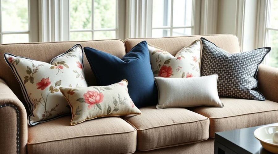
You can mix throw pillow patterns without making a sofa or bed look busy by controlling three things: color, pattern scale, and visual weight. Start with colors already in the room, choose one pattern to lead, add quieter supporting prints, and use a solid or textured pillow when the arrangement needs a pause. The goal is coordination, not perfect matching.
Quick Answer
To mix throw pillow patterns, choose a shared color palette, combine patterns at noticeably different scales, and include at least one solid or textured pillow for contrast. Start with one statement print, add a quieter geometric or small-scale pattern, then adjust the number and sizes to fit the sofa without crowding the seat.
Key Takeaways
Key Takeaways
- Build the pillow palette from colors already present in the rug, art, curtains, walls, or upholstery.
- Use noticeably different pattern scales so the prints do not compete at the same visual volume.
- A statement print, a quieter supporting pattern, and a solid or textured pillow is an easy starting formula.
- Odd numbers often feel relaxed and asymmetrical; even numbers can work just as well when you want a balanced, tailored arrangement.
- Layer larger pillows behind smaller ones, but keep enough of the seat clear for comfortable use.
- Treat decorating formulas such as 60-30-10 and 2-2-1 as starting points, not rules you must follow.
At a Glance
| Time Required | About 10–20 minutes to test and edit an existing arrangement |
| Difficulty | Easy |
| Tools Needed | No special tools; a measuring tape is helpful when choosing new pillow sizes |
| Cost | $0 when rearranging pillows you own; otherwise depends on covers and inserts selected |
How to Build a Pillow Color Palette
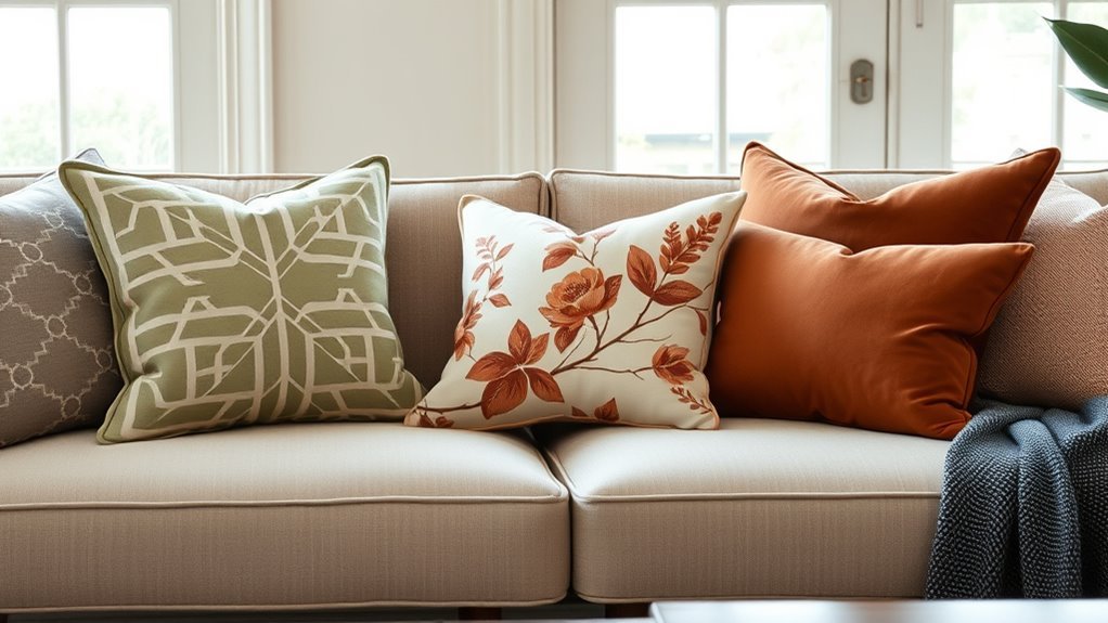
Start with the room rather than shopping for pillows in isolation. Look at the rug, artwork, curtains, wall color, and upholstery, then identify two or three colors you would like the pillows to repeat.
One shade can lead while one or two others act as accents. A neutral such as ivory, beige, gray, brown, or black can help separate stronger colors without introducing another competing hue.
Choose colors from the room first, then let the pillows repeat and connect those colors instead of creating a separate palette.
Pay attention to undertones, but do not assume warm colors must only be paired with warm colors or cool shades only with cool ones. Warm-and-cool contrast can work well when it looks deliberate and at least one color repeats elsewhere in the room.
If you want more structure, the 60-30-10 color guideline described by Sherwin-Williams can be a useful starting point: let one color dominate, use a secondary color less often, and reserve a smaller amount for an accent. You do not need to calculate the percentages precisely for a pillow arrangement.
Note: 60-30-10 is a decorating framework, not a requirement. A monochromatic sofa, a maximalist room, or a simple two-color scheme can work without following it.
Which Pillow Patterns Work Best Together?
An easy combination is one expressive pattern and one more structured pattern. For example, pair a loose floral or botanical with a stripe, check, dot, or simple geometric. The contrast between the motifs helps each design stay distinct.
Color provides the connection. Look for at least one shade that appears in both prints or connects them to the sofa, rug, or artwork.
Pottery Barn’s pattern-mixing guidance also recommends repeating colors, varying scale, and adding solids or texture to give the eye places to pause.
Pattern Pairing Basics
Start with an anchor print: the pillow with the strongest motif, most color, or greatest visual presence. A multicolor floral, block print, oversized stripe, abstract design, or bold geometric can all fill this role.
Next, choose a supporting print that shares at least one color with the anchor but differs in structure or scale. If the anchor is an oversized floral, for example, a narrow stripe or small check can provide contrast without competing with it.
For an easy beginner arrangement, two patterns plus a solid or textured pillow is often enough. Three different patterns can also work when their scales are clearly different and their colors remain connected.
This is a starting framework rather than a hard limit. A maximalist room can support more pattern, while an already-busy room may look better with only one patterned pillow.
Scale and Texture Balance
Pattern scale is the size of the repeated motif. When several pillows use motifs of nearly the same size, they tend to compete. Separating the scales makes the arrangement easier to read.
A practical formula is:
- Large scale: the statement or anchor pattern.
- Medium scale: a quieter connector such as a stripe, check, or moderate geometric.
- Small scale or texture: a fine print, woven texture, or solid fabric that settles the mix.
Crate & Barrel’s pattern guide similarly recommends varying print size while keeping colors consistent and using solids to create visual relief.
Texture can provide contrast without adding another print. Linen beside velvet, boucle beside cotton, or wool beside a smooth weave adds depth while preserving the same color story.
Pro Tip: Step several feet away and look at the arrangement from across the room. If two prints merge into the same visual texture, their scales may be too similar. Replacing one with a larger motif, smaller motif, or solid usually creates clearer separation.
How to Adjust Patterns to Your Sofa and Room
The amount of pattern your pillows can comfortably carry depends on what is already happening around them.
On a solid sofa: you have more freedom to introduce a statement print, a second contrasting motif, and a textured solid. A quiet sofa acts as visual background.
On patterned upholstery: let the sofa pattern count as part of the mix. Choose more solids, textures, or a restrained secondary print rather than covering the upholstery with several equally strong motifs.
In a room with a bold rug, wallpaper, curtains, or artwork: repeat one or two colors from those features, but consider simplifying the pillow patterns. The room already has a focal point.
In a neutral room: pillows can carry more of the color and pattern because they are not competing with as many surrounding elements.
This is why the same set of pillows can feel calm on one sofa and overwhelming on another.
How Many Throw Pillows Should You Use?
There is no single correct pillow count. The sofa’s width, depth, arm style, and intended use matter more than a fixed number.
As a loose starting point, a chair may need one pillow, a loveseat may use two or three, and a full-size sofa may use roughly three to six. Larger sectionals can support more because they have more seating zones. The arrangement should still leave enough open space for people to sit comfortably.
Pottery Barn’s pillow-arranging guidance recommends scaling from larger pillows toward smaller ones and specifically cautions against filling the furniture so completely that lounging becomes difficult.
Odd numbers such as three or five often create a relaxed, asymmetrical look. Even numbers can create a cleaner, more symmetrical arrangement. Neither is inherently better.
Choose the number of pillows by proportion and usable seating space, not by a rule that every sofa must have the same count.
What Pillow Sizes Create the Best Layers?
Size variation creates depth. On many standard sofas, 22- or 24-inch squares work well as back or corner anchors, while 18- to 21-inch squares fit comfortably in front. A rectangular lumbar pillow can add a different shape and create a lower front layer.
Those sizes are examples, not requirements. A low-back or compact sofa may look better with smaller pillows, while a deep sectional can handle larger ones.
For a common layered arrangement, try:
- 22×22-inch or 24×24-inch pillows at the back corners;
- 18×18-inch or 20×20-inch pillows slightly forward;
- a lumbar or smaller accent pillow near the front or center.
On a bed, 26×26-inch Euro pillows can create a tall backdrop, with sleeping pillows and smaller decorative pieces layered forward.
Insert sizing also depends on the desired look and the cover manufacturer’s recommendations. A same-size insert gives a more relaxed fit, while going one standard size larger can create a firmer, fuller appearance. The Company Store, for example, recommends the same size for a standard fit or one size larger for a fluffier decorative pillow.
Where Do Solid Throw Pillows Fit?
Solid throw pillows give patterned pieces breathing room. They are especially useful when two prints are competing, the room already contains several patterns, or you want to repeat an important color without adding another motif.
Solid Pillows as Anchors
A solid pillow can separate two patterned pillows, ground an outer corner, or repeat a color from the anchor print. It does not need to be visually plain: linen, velvet, boucle, wool, leather, or an embroidered solid can provide plenty of surface interest.
| Placement | Effect |
|---|---|
| Between prints | Creates visual separation |
| At an outer corner | Grounds the grouping |
| In a repeated room color | Connects the pillows to the room |
| In a tactile fabric | Adds depth without another motif |
Texture Over Pattern
When there is already enough print, replace another pattern with texture. A nubby boucle, washed linen, plush velvet, chunky weave, or wool pillow can create contrast through its surface rather than its motif.
This works particularly well in monochromatic rooms. Several pillows can stay within one color family while still looking layered because their surfaces reflect light differently.
Balancing Busy Prints
If an arrangement feels crowded, use solids to slow it down. Repeat a color that already appears in the patterned pillows instead of introducing a completely unrelated shade.
- Place a solid between two strong prints.
- Repeat a dominant or secondary color from the anchor pattern.
- Use texture when you want depth without another graphic element.
- Reduce the number of patterns when the sofa, rug, or curtains are already busy.
- Leave some upholstery visible rather than filling every inch with pillows.
If you enjoy numerical frameworks, you can loosely adapt 60-30-10 to the mix—for example, a dominant quiet color or texture, a secondary pattern, and a smaller statement accent. Treat the proportions as a visual guide, not a measurement exercise.
How to Mix Pillow Pattern Scales
A useful pattern-scale formula is one large motif, one medium motif, and one small motif or textured solid. The large pattern creates the focal point, the medium pattern connects it to the group, and the smallest element adds detail without competing at the same scale.
| Scale | Role | Example |
|---|---|---|
| Large | Anchor | Oversized floral, botanical, abstract, or broad stripe |
| Medium | Connector | Check, medium geometric, block print, or narrower stripe |
| Small | Detail | Tiny dot, fine stripe, small repeat, or subtle motif |
| Solid/texture | Visual rest | Linen, velvet, boucle, wool, or woven cotton |
| Final check | Balance | View the group from across the room and remove anything competing |
Florals and stripes are a classic example because one is organic and one is structured, but the same logic applies to many combinations. A painterly abstract can work with a small check; a bold geometric can work with a fine botanical.
The shared color story is what keeps contrasting motif families connected.
Which Pillow Textures Work Together?
Mix smooth and tactile surfaces rather than choosing every pillow in the same fabric. Linen, velvet, boucle, wool, knits, and cotton can work together because each responds differently to light and touch.
- Linen: relaxed texture with a crisp, natural appearance.
- Velvet: soft surface with richer light and shadow.
- Boucle: nubby texture that adds dimension without a printed motif.
- Wool or knit: heavier texture suited to a cozy, layered look.
- Cotton: versatile and visually lighter, especially in simple weaves.
Seasonal changes can come from fabric weight rather than a completely new color scheme. Heavier velvets and knits can make a room feel cozier in cooler months, while linen and cotton tend to look lighter.
You do not need every texture in one arrangement. Two or three surfaces are usually enough to create noticeable depth.
How Should You Arrange Throw Pillow Patterns?
Instead of relying on instinct alone, use this simple process and adjust it to the size of your furniture.
- Choose the color story. Pull two or three useful colors from the room.
- Select the anchor. Pick the boldest or most expressive pattern first.
- Add contrast in scale. Choose a second pattern with a noticeably smaller or simpler motif.
- Add visual rest. Use a solid or textured pillow if the prints need separation.
- Layer by size. Put larger pillows behind or toward the outer corners and smaller shapes forward.
- Edit for function. Step back, check the whole room, and remove anything that crowds the seat or competes with the main pattern.
A five-pillow sofa could use two large outer pillows, two smaller inner pillows, and one lumbar in the center. A three-pillow setup could use one large patterned anchor, one smaller supporting print, and one textured solid. A symmetrical room can also use matching pairs.
Good pillow styling is less about following one formula and more about creating clear hierarchy: something leads, something supports it, and something gives the eye a pause.
What Should You Remove When It Feels Too Busy?
If the arrangement feels crowded, do not immediately replace everything. Remove one element at a time and identify what is creating the conflict.
- Remove a pattern with no color connection. A print that introduces several unrelated colors can make the group feel detached from the room.
- Remove one of two similar-scale prints. Two equally loud patterns often compete more than a large print paired with a fine one.
- Remove an unnecessary accent color. Too many unrelated hues can weaken the color story.
- Replace a print with texture. A solid velvet, linen, or boucle pillow can keep the depth without adding another motif.
- Remove pillows that block normal seating. A sofa still needs to function as furniture.
Also check for the opposite problem: an arrangement can feel flat when every pillow is the same size, fabric, color intensity, or pattern scale. In that case, removing a pillow may not be enough; changing one element to a contrasting size or texture can improve the hierarchy.
Pro Tip: Take a quick phone photo of the sofa. Seeing the arrangement flattened into one image often makes a competing color, repeated scale, or overcrowded corner easier to notice.
Frequently Asked Questions
What Is the 2-2-1 Throw Pillow Rule?
The 2-2-1 pillow formula uses five decorative pillows: two larger pillows as the back or outer layer, two slightly smaller pillows inside or in front of them, and one accent or lumbar pillow to finish the arrangement. It is a useful template for a standard sofa, but it is optional rather than a universal decorating rule.
How Do You Mix Patterns for Throw Pillows?
Start with one statement pattern, then add a second print with a noticeably different scale. Connect the prints through one or more shared colors and use a solid or textured pillow when the group needs visual separation. Florals with stripes, botanicals with checks, and bold geometrics with fine repeating motifs are useful starting combinations.
What Is the Throw Pillow Rule?
There is no single throw pillow rule. Useful guidelines include repeating colors from the room, varying pattern scale, layering larger pillows behind smaller ones, and leaving enough seating space. Formulas such as 60-30-10, odd-number groupings, and 2-2-1 arrangements can make decisions easier, but they can all be adjusted to the furniture and style you prefer.
Do Throw Pillows Have to Share the Same Color?
No. They do not need to match exactly, but repeating at least one color, undertone, or nearby room color makes a mixed arrangement easier to connect. You can also combine contrasting colors intentionally when another element in the room supports that contrast.
Should Throw Pillows Be an Odd Number?
Not necessarily. Three or five pillows can create a relaxed, asymmetrical look, while two, four, or six can create stronger symmetry. Choose the number that fits the width of the furniture, the look you want, and the amount of seating space you need.
Should a Pillow Insert Be Larger Than the Cover?
It can be, but it does not have to be. A same-size insert gives a more relaxed fit, while an insert one standard size larger can create a fuller, firmer decorative pillow. Always check the cover manufacturer’s sizing recommendation, especially for lumbar pillows, stiff fabrics, or covers with delicate seams.
What Are the Throw Pillow Trends for 2026?
There is no single 2026 pillow look. Current home-design directions include expressive color and floral motifs alongside handcrafted texture, warm earthy neutrals, and layered natural-looking materials. IKEA’s 2026 Style Guide highlights ideas such as Joycore and Floral Daydream, while major color forecasts also emphasize grounded browns, tans, and warm neutrals. The easiest way to use a trend is through one removable pillow or cover rather than rebuilding the entire room around it.
Conclusion
Mixing throw pillow patterns becomes easier when you stop trying to make every pillow match. Build from colors already in the room, let one pattern lead, vary the scale of supporting prints, and use solids or texture when the arrangement needs breathing room.
Then judge the whole group in context. A solid sofa can carry more pattern than busy upholstery, a compact loveseat needs fewer layers than a sectional, and a symmetrical room may look better with an even number of pillows. Formulas such as 60-30-10 or 2-2-1 are useful starting points, but the final test is simpler: the pillows should look connected to the room and still leave the furniture comfortable to use.
Sources
- Pottery Barn — How to Mix & Match Patterns — pattern scale, shared colors, solids, texture, and 60-30-10 pattern guidance.
- Pottery Barn — How to Arrange Pillows — pillow layering, odd and even groupings, pattern coordination, and functional seating space.
- Crate & Barrel — How to Style Throw Pillows — pillow size, layering, color stories, pattern combinations, and textured solids.
- Sherwin-Williams — How to Build a Color Palette — three-color palettes and the 60-30-10 color framework.
- The Company Store — Decorative Pillow Covers — same-size versus larger inserts for different levels of fullness.
- IKEA — 2026 IKEA Style Guide — current 2026 interior directions including Joycore and Floral Daydream.