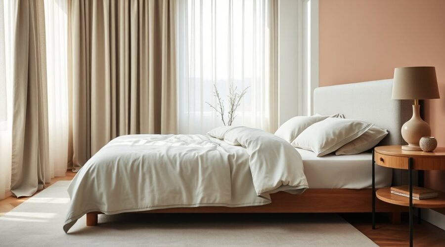
If your bedroom gets harsh afternoon sun, you might start with a soft sage wall and warm ivory bedding to soften the glare. You can build a restful palette by balancing light neutrals with muted blues or greens, then adjust for room size, furniture, and natural light. The right mix can make the space feel calmer than you expect, especially once you test a few shades on the wall.
Key Takeaways
- Choose soft blues, greens, light neutrals, or pastel pinks to create a calm, restful bedroom atmosphere.
- Avoid stimulating reds, oranges, and heavy dark purples that can make the room feel energetic or heavy.
- Match color depth to the room: use light shades for small or dim rooms and deeper tones sparingly in larger spaces.
- Build the palette around warm neutrals, then add gentle blue, green, or gray accents for balance and visual interest.
- Test large swatches in natural and artificial light before deciding, since colors shift throughout the day.
What Colors Make a Bedroom Feel Restful?
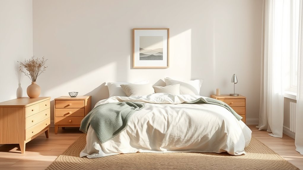
When you want a bedroom to feel restful, choose colors that naturally calm the eye and quiet the mind. In color psychology, soft blues and greens often lead the way because they echo nature and support a calming atmosphere.
If you want a space that feels open yet composed, light neutrals like soft beige, taupe, and light gray can give you that elegant, serene base without demanding attention. You can also bring in pastel pinks when you want warmth and comfort; they soften the room and encourage relaxation.
Use these tones to create a room that reflects your pace, not pressure. Avoid stimulating reds and oranges, which can energize instead of restore, and skip dark purples if you want the room to feel light.
Choose tones that match your pace, not your pressure—skip energizing reds and heavy purples for a lighter, calmer room.
With the right palette, you get more than style—you claim a bedroom that helps you rest, reset, and breathe freely.
Choose Bedroom Colors by Room Size and Light
When you choose bedroom colors, start with the room’s size: light shades can make a small space feel larger, while deeper tones can add comfort to a bigger room.
You’ll also want to account for natural light, since daylight changes how paint looks and dim rooms usually benefit from brighter hues.
Soft blues, pale greens, and even Alabaster SW 7008 can help open up the space and keep it feeling calm.
Room Size Matters
Room size and light should guide your bedroom color choices, since the same paint can feel airy in a small, sunlit space and much more enclosed in a compact room with little natural light.
In a tight room, choose light colors like alabaster, soft pastels, or muted colors to open the walls and support a calming effect. If you want intimacy, darker shades can work, but use them sparingly so they don’t weigh the room down.
In larger bedrooms, balance color with the 60-30-10 rule: let one hue lead, add a second for support, and finish with an accent.
Soft blues, greens, and warm neutrals can help you shape a space that feels restful, spacious, and fully yours.
Natural Light Effects
Natural light can change a bedroom color more than the paint chip suggests, so it’s worth pairing your palette with the room’s brightness as well as its size.
In a dim room, lighter colors can lift the space and make it feel open. If your bedroom gets generous natural light, cooler colors like soft blue or green can steady the glow and keep the mood calming.
Darker paint color choices can feel intimate in a bright room, though they can crowd a smaller one.
Notice your windows too: north-facing light reads cooler, while south-facing light feels warmer.
Test swatches morning, noon, and evening so you can trust choosing the best colors for a restful room that supports you all day.
Best Colors For Space
To choose bedroom colors that suit your space, start with the room’s size and how much light it gets.
In a small room, the best colors for space are soft colors like pale blue or gentle green, which open the walls and feel airy.
In a larger room, deeper shades can create a grounded, intimate mood.
If your bedroom gets dim natural light, try warm tones such as light beige or soft peach to brighten the space and soften the edges.
In bright rooms, cool grays and blues work well because they calm glare.
Test your bedroom palette at different times of day, then build balanced color schemes with the 60-30-10 rule so your room feels free, restful, and fully your own.
Build a Bedroom Color Palette With Warm Neutrals
Warm neutrals like soft creams, warm whites, and light taupes give your bedroom an open, calming base that feels both relaxed and adaptable. You can use these warm neutrals to support relaxation without locking yourself into a rigid look.
Their quiet presence lets your furniture, bedding, and textiles take center stage, creating visual harmony instead of competition. Build depth by layering cream with taupe and other gentle variations; this keeps the room interesting while preserving a soothing palette.
Choose earthy materials like wood, linen, or woven fibers to reinforce a cohesive design that feels grounded and free of excess. When you repeat warm neutrals in your bedding, rugs, and decor, you strengthen the restful mood and keep the space inviting.
This approach gives you room to breathe, express yourself, and enjoy calm on your own terms.
Add Calm With Blue, Green, and Gray Accents
You can bring a sense of calm to your bedroom with soft blue accents that feel serene and restful.
Add gentle green and light gray touches to create balance, warmth, and a quiet connection to nature.
Used in bedding, pillows, or wall art, these colors work together to build a soothing, cohesive retreat.
Blue Accents For Calm
Soft blue accents can bring an immediate sense of calm to your bedroom, creating a restful backdrop that encourages relaxation. You can use blue accents in bedding, pillows, or artwork to shape a calming vibe without committing to a full room overhaul.
Pair them with muted sage or light gray to keep your color palette balanced and refined. In rooms with strong natural light, cooler blues help soften brightness and support a restful environment.
Choose varied shades so the space feels layered, not flat, and let each piece breathe. When you edit your room with intention, you free it from clutter and make room for ease, quiet, and better rest.
Green And Gray Harmony
When you want a bedroom that feels settled and serene, soft green and gray are a natural pairing, since both colors bring a quiet sense of calm to the space. You can build a restful palette with Sea Salt and Repose Gray, then let light blue accents soften the edges. Use gray as the base, green as the support, and blue as the lift.
| Color | Feeling | Use |
|---|---|---|
| Gray | steady | walls |
| Green | renewing | bedding |
| Blue | soothing | pillows |
This calming mix balances light and shadow, so your room works in bright sun or dim evenings. With this green and gray harmony, you create a polished retreat that feels free, grounded, and deeply restful.
Pick a Bedroom Color Scheme That Fits Your Style
Choosing a bedroom color scheme that fits your style starts with the mood you want the room to create. Think about bedroom colors that support calm, ease, and self-expression, not rules that box you in.
If you want serenity, an analogous scheme can weave nearby hues into a soft flow. If you crave energy, use complementary colors sparingly for contrast.
For choosing the right bedroom palette, a monochromatic scheme can feel especially freeing, because it lets one color breathe in many tones. Let an accent wall or subtle accents sharpen the look without taking over.
The 60-30-10 rule helps you stay balanced:
- 60% main color
- 30% secondary shade
- 10% bold accent
- Nearby hues for harmony
- One-color layers for depth
Trust your eye, and choose a scheme that feels like your space, your pace, your calm.
Match Bedroom Paint to Your Furniture
Your furniture’s undertones should guide your bedroom paint choice, so the walls feel intentional rather than mismatched. When you match bedroom paint to your furniture, you let the room breathe with ease instead of fighting itself.
Warm wood tones look beautiful beside soft neutrals like Accessible Beige SW 7036, while dark wood feels brighter against lighter shades such as Alabaster SW 7008. If you live with cherry wood, muted greens or grays like Mindful Gray SW 7016 can deepen the richness without stealing attention.
In smaller rooms, choose lighter shades on the walls to keep dark furniture from feeling heavy or cramped. You can also create a calming, unified look by using a monochromatic approach, letting colors can make subtle shifts across paint, bedding, and accents.
That kind of harmony supports a restful bedroom and gives you the freedom to make the space feel truly yours.
Use the 60-30-10 Rule in Your Bedroom
A simple 60-30-10 palette can bring instant balance to your bedroom: use 60% for a calming main color, 30% for a secondary shade, and 10% for a bold accent. The 60-30-10 rule helps you shape a restful atmosphere without feeling restricted.
Let your calming main color, like soft gray or beige, cover walls, bedding, or curtains. Add a secondary color, such as pale blue or soft green, to build depth and ease. Then choose an accent color, maybe deep teal or burgundy, for pillows, artwork, or a lamp.
- 60%: soothing base
- 30%: gentle contrast
- 10%: vivid spark
- Keep the palette cohesive
- Use accents sparingly
This approach lets you express yourself with clarity, while keeping the room serene, balanced, and open enough to breathe.
Test Bedroom Colors Before You Paint
Before you commit to a bedroom palette, test the colors on your walls so you can see how they truly behave in your space.
To test bedroom colors well, paint swatches at least two feet wide, or use painter’s tape to frame them. Small chips can lie; larger samples reveal depth, undertones, and how a shade will transform your space.
Check them in natural and artificial light, morning, noon, and night, because color can shift from calm to cold or warm to washed out.
Look at the swatches beside your bedding, art, and furniture so the palette supports your existing pieces instead of fighting them.
If you want extra confidence, use an augmented reality app to preview options before you buy.
This hands-on process helps you move with clarity, making selecting the perfect restful bedroom color feel less like guesswork and more like choosing your own atmosphere.
Frequently Asked Questions
What Is the Most Restful Color for a Bedroom?
You’ll usually find soothing blues the most restful for a bedroom. They calm your mind, echo sky and water, and help you unwind.
You can also layer calming neutrals, tranquil greens, soft pastels, and warm earthtones to create a balanced, freeing space.
Keep the palette light and avoid bright reds or oranges, since they can feel energizing.
Choose what helps you breathe easier and sleep deeper.
What Color Makes a Bedroom Feel Cozy?
Soft neutrals make a bedroom feel cozy, and you can deepen that comfort with deep hues and warm accents.
Choose calming shades like beige, taupe, pale blue, or muted green, then layer textured fabrics to add depth and softness.
You don’t need much color to create ease; a few thoughtful tones can free your space from harshness and help you feel settled, held, and completely at home.
What Is the 60-30-10 Rule for Decorating Bedrooms?
The 60-30-10 rule means you use 60% neutral tones, 30% a secondary color, and 10% accent colors for strong color balance.
You can let your personal preferences guide the shades, while mood influences help you choose softer or richer tones.
This approach keeps your bedroom grounded, flexible, and expressive, so you don’t feel boxed in by one dominant color.
It also makes decorating feel intentional, calm, and free.
How to Pick a Color Palette for a Bedroom?
Pick a palette by blending color psychology with your personal preference, then check how each shade affects mood influence in your room.
You’ll want to notice light impact throughout the day, because colors can shift from calm to harsh.
Build color harmony with a main neutral, a supporting hue, and a small accent.
Test samples on your walls, trust what feels freeing, and choose tones that support your rest.
Conclusion
To choose a restful bedroom palette, you’ve got to let color work like a soft lullaby. Start with gentle blues, greens, and warm neutrals, then shape the shade to fit your room’s light and size. Let accents whisper instead of shout, and tie everything together with your furniture and the 60-30-10 rule. When you test samples first, you’ll see your room settle into a calm, inviting haven that feels like a deep breath.