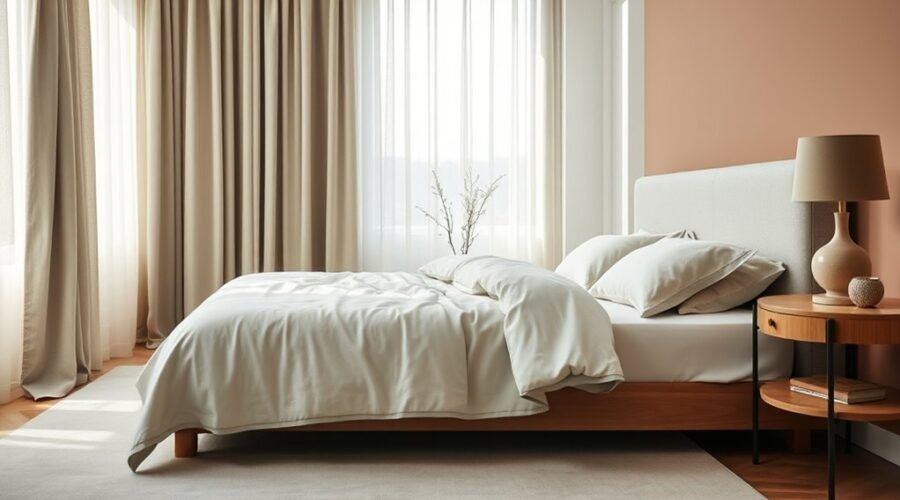
If your bedroom gets harsh afternoon sun, a soft sage wall with warm ivory bedding can soften the overall look. A restful bedroom palette usually works best when you combine muted colors with the room’s actual light, size, furniture, flooring, and your own preferences. Instead of choosing a shade from a tiny paint chip, narrow your options, test them in the room, and watch how they change from morning to night.
Quick Answer
For a restful bedroom, start with muted blues, greens, warm whites, beige, taupe, or soft gray. Favor lower-saturation shades, then adjust for your room’s light, size, furniture, and personal preference. Color can shape how a room feels, but no wall color is proven to guarantee better sleep, so test samples before painting.
Key Takeaways
- Muted blues, greens, warm whites, beige, taupe, and soft grays are strong starting points for a quiet bedroom palette.
- Hue is only part of the decision. Lightness, saturation, undertones, room orientation, and artificial lighting can change how a color feels.
- Light shades can make a compact or dim room feel more open, while deeper muted colors can create a cozy, enveloping effect.
- Coordinate paint with fixed finishes such as flooring, furniture, headboards, and curtains before buying gallons of paint.
- Test several large samples in morning, afternoon, and evening light before making the final choice.
What Colors Make a Bedroom Feel Restful?
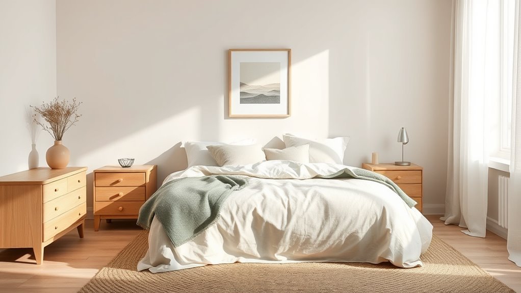
Colors that look quiet rather than highly saturated are usually the easiest starting point when you want a bedroom to feel restful. Soft blues, muted greens, warm whites, beige, taupe, dusty pink, and gentle gray can all create a low-key backdrop that does not compete with bedding, furniture, or artwork.
There is some research behind common color-emotion associations, but it is important not to overstate it. Large reviews of color research find that blue and green are often associated with positive, lower-arousal emotions, while red, orange, and yellow are more often associated with higher arousal. Those findings describe tendencies and associations, not a guarantee that painting a bedroom blue will improve sleep.
Note: Think of bedroom color as one part of the room’s atmosphere. Personal preference, lighting, noise, temperature, bedding, and the rest of the sleep environment matter too. Choose a color that feels comfortable to you rather than treating any single hue as a sleep treatment.
Lightness and saturation also matter. A dusty brick red may feel much quieter than a vivid fire-engine red, just as a deep muted navy can feel more restful than an electric blue. If you love warm or dark colors, you do not have to eliminate them; simply look for softer, grayer, or less saturated versions and balance them with quieter surfaces.
For a calmer-looking bedroom, pay attention to lightness and saturation as much as the color name itself.
Choose Bedroom Colors by Room Size and Light
Room size and lighting can change the way the same paint color looks. A soft gray that feels airy in a bright bedroom may appear noticeably darker or cooler in a room with limited daylight. Start by studying the room before choosing the paint.
Room Size Matters
In a compact bedroom, lighter colors such as warm white, pale blue, soft green, or light greige can increase the sense of openness by reflecting more available light. They do not physically enlarge the room, but they can reduce visual heaviness.
Darker shades can still work in a small bedroom when you want an intimate, cocooning effect. Muted navy, charcoal, forest green, or deep taupe can be effective when the ceiling, bedding, trim, or other surfaces keep enough contrast and light in the room.
In a large bedroom, you have more freedom to use medium or deeper tones. A richer wall color can make a large room feel less empty, while lighter colors preserve an airy look.
Natural Light Effects
Natural light changes throughout the day, and room orientation influences the color cast. North-facing rooms generally receive cooler, less direct light, so cool grays or blue-based whites may appear colder than expected. Warm whites, beige, taupe, or colors with slightly warmer undertones can help balance that effect.
South-facing rooms tend to receive warmer light for much of the day. That makes many colors easier to use, although an already warm beige, yellow, or peach can look stronger when direct sun hits it.
East-facing bedrooms are usually warmer and brighter in the morning and cooler later in the day. West-facing bedrooms do the reverse: they often start relatively cool and become much warmer in the afternoon and evening. Because bedrooms are used at several times of day, neutral or moderately muted colors are often easier to live with in east- and west-facing rooms.
Artificial light matters too. Warm lamps can pull beige, cream, red, and yellow undertones forward, while cooler lighting can emphasize blue or gray undertones. Always judge the color under the lamps you normally use at night.
Best Colors For Space
Use the room’s conditions to narrow the palette instead of choosing from hundreds of unrelated swatches.
| Bedroom Condition | Good Starting Colors | Watch For |
|---|---|---|
| Small or dim | Warm white, pale greige, light sage, muted blue | Very cool grays becoming flat or chilly |
| Bright and sunny | Soft blue, sage, balanced gray, muted taupe | Warm colors becoming stronger in direct sun |
| Dark furniture | Light beige, warm white, pale green, light greige | Too many dark surfaces competing for light |
| Large bedroom | Medium taupe, muted navy, forest green, deeper gray | Using several strong colors without a quiet base |
Understand Undertones and LRV
Two paints that both look “gray” on a screen can behave completely differently on a wall. One may have a blue or violet undertone, while another leans green, beige, or brown. Compare similar samples side by side instead of judging each one in isolation; the undertones become easier to see.
You can also check a paint’s Light Reflectance Value (LRV). LRV is a 0-to-100 scale used to describe how much visible light a surface reflects. A higher number generally indicates a lighter, more reflective paint, while a lower number indicates a darker shade. LRV does not tell you whether a color will look good, but it is useful when comparing several shades for a dim or bright room.
Build a Bedroom Color Palette With Warm Neutrals
Warm neutrals such as soft cream, warm white, beige, mushroom, greige, and light taupe give a bedroom an adaptable base. They work especially well when you already have wood furniture, natural-fiber rugs, linen bedding, or other materials with warm undertones.
The easiest way to keep a neutral room from looking flat is to vary texture and value rather than adding many unrelated colors. For example, combine warm-white walls with oatmeal bedding, a medium-taupe rug, pale oak furniture, and one muted green or blue accent.
Natural materials such as wood, linen, wool, cotton, rattan, and woven fibers can provide enough visual variation that the room still feels layered without needing a loud wall color.
Pro Tip: Start with the finishes you cannot easily change—flooring, large furniture, headboard, stone, and built-ins. Choose wall paint after you understand the undertones already present in those fixed elements.
Add Calm With Blue, Green, and Gray Accents
Blue, green, and gray are easy to combine because muted versions can sit quietly beside warm neutrals. You can use them on the walls or introduce them through bedding, pillows, curtains, rugs, lamps, and artwork.
Keeping one color dominant and the others secondary prevents the room from looking busy. The exact proportions do not have to follow a rigid formula; the goal is visual hierarchy rather than mathematical precision.
Blue Accents For Calm
Soft blue works well when you want a bedroom to look cool, airy, or understated. Dusty blue, blue-gray, and muted denim are usually easier to coordinate than highly saturated cobalt or electric blue.
In a bedroom with strong warm sunlight, a cooler blue can visually balance the light. In a north-facing room, however, the same blue may look colder than it did on the sample card. Pair it with warmer whites, natural wood, cream textiles, or other warm materials if the room needs balance.
If you like specific manufacturer colors, Sherwin-Williams currently includes light blues and greens among its bedroom recommendations. Treat named paint colors as starting points rather than universal solutions because the surrounding light and finishes will alter their appearance.
Green And Gray Harmony
Soft green and gray can create a restrained palette when their undertones work together. A green-gray such as Sea Salt SW 6204 can provide color without reading as intensely green, while a neutral gray such as Repose Gray SW 7015 can serve as a quieter base.
| Color | Typical Role | Possible Use |
|---|---|---|
| Gray | Quiet base | Walls or upholstered pieces |
| Green | Natural supporting color | Bedding, walls, curtains |
| Blue | Cool accent | Pillows, artwork, throws |
Before combining gray and green, compare their undertones. A violet-gray beside a yellow-green may feel disconnected, while a warmer greige can sit naturally beside olive or sage.
Pick a Bedroom Color Scheme That Fits Your Style
Choosing a bedroom color scheme starts with the mood and visual style you want rather than a list of colors you are “supposed” to use. Personal preference matters because a color you already dislike is unlikely to become restful simply because it appears on a recommended palette.
An analogous scheme uses neighboring colors, such as blue, blue-green, and green, for a smooth transition. A monochromatic scheme uses lighter and darker versions of one color, which is useful when you want variety without strong contrast.
A complementary scheme can also work in a bedroom, but use the stronger contrasting hue in smaller amounts if your goal is a quieter room. For example, a muted blue room can take a small rust, terracotta, or warm-brown accent without turning the entire palette energetic.
Instead of choosing wall paint first, build the palette in this order:
- Identify fixed colors in flooring, furniture, built-ins, and the headboard.
- Choose the main wall color that works with those undertones.
- Select bedding and large textiles that connect the wall and furniture colors.
- Add one or two smaller accent colors through pillows, lamps, art, or decor.
- Repeat each important color at least once so it feels intentional rather than accidental.
Match Bedroom Paint to Your Furniture
Your furniture’s undertones can guide your bedroom paint choice. Warm woods often pair naturally with warm white, beige, taupe, muted green, and softened blue. Dark wood furniture generally creates more contrast against lighter walls, which can help prevent the room from looking visually heavy.
Accessible Beige SW 7036 is one example of a warm neutral that can work with dark brown furniture. Alabaster SW 7008 offers a lighter option. Cherry wood has stronger red and orange undertones, so muted greens, warm grays, or greiges can provide contrast without competing with the wood.
Mindful Gray SW 7016 is one manufacturer example often suggested with cherry wood, but always test it against the actual furniture. Wood stain, age, flooring, daylight, and bulb temperature can shift the relationship.
In smaller rooms with dark furniture, lighter wall colors can preserve contrast. If you intentionally want a dark, enveloping bedroom, you can instead repeat a deeper wall color and keep bedding, lampshades, or trim lighter so the room still has visual separation.
Use the 60-30-10 Rule in Your Bedroom
The 60-30-10 approach is a useful decorating shortcut, not a rule you have to follow exactly. The idea is to give one color most of the visual space, a second color a supporting role, and a third color a small accent role.
- About 60%: the main color, often walls, large bedding, or both.
- About 30%: the secondary color used in curtains, furniture, rugs, or additional bedding.
- About 10%: a stronger accent used in pillows, lamps, artwork, or small decor.
For example, you might combine warm-white walls with sage bedding and a small amount of deep teal. Another room could use soft gray as the base, dusty blue as the secondary color, and muted burgundy as the accent.
Do not worry about measuring exact percentages. If the room clearly has a dominant color, a supporting color, and a restrained accent, the principle is already doing its job.
Test Bedroom Colors Before You Paint
Paint chips and phone screens are useful for narrowing choices, but they cannot show exactly how a color will behave on your bedroom walls. Natural light, artificial light, nearby surfaces, and even the color of the floor can change what you see.
Use a large painted sample or removable paint sample for each finalist rather than relying on a tiny chip. Test a short list—usually three or four serious candidates is enough—and compare them rather than evaluating one shade in isolation.
- Place samples in more than one area. Check a bright wall and a wall that stays in shadow.
- Look in the morning. Notice cool or warm casts from natural light.
- Check again in the afternoon. Direct sun can make undertones much stronger.
- Judge the color at night. Turn on the lamps and fixtures you actually use in the bedroom.
- Compare it with fixed finishes. Hold the sample near the floor, furniture, headboard, curtains, and bedding.
- Live with the finalists for several days. Eliminate colors that repeatedly look wrong rather than choosing from one favorable moment.
Digital color visualizers can help you narrow the field, but they should supplement physical samples rather than replace them because screens and real-world lighting reproduce color differently.
Pro Tip: If two neutral samples seem almost identical, place them directly beside each other and beside a known white surface. The comparison often makes hidden blue, green, violet, pink, or yellow undertones much easier to spot.
Frequently Asked Questions
What Is the Most Restful Color for a Bedroom?
There is no single scientifically proven “most restful” bedroom color. Muted blue and green are commonly associated with lower-arousal, calmer feelings, while warm whites, beige, taupe, dusty pink, and soft gray can also create a quiet backdrop. Your preference, the color’s saturation, and the room’s lighting matter just as much as the hue name.
What Color Makes a Bedroom Feel Cozy?
Warm white, cream, beige, taupe, mushroom, muted terracotta, deep green, navy, and other softened colors can all make a bedroom feel cozy. Texture also matters: linen, wool, wood, rugs, curtains, and layered bedding often add as much warmth as the wall color itself.
What Is the 60-30-10 Rule for Decorating Bedrooms?
The 60-30-10 approach uses one dominant color for roughly 60% of the room, a secondary color for about 30%, and an accent for about 10%. Treat those numbers as a flexible design guide rather than exact measurements. Its main purpose is to create a clear visual hierarchy.
How Do You Pick a Color Palette for a Bedroom?
Start with permanent or expensive-to-change elements such as flooring, furniture, and the headboard. Choose a wall color that works with those undertones, add a coordinating bedding or textile color, then finish with one restrained accent. Test the complete palette in your room’s actual daylight and nighttime lighting before committing.
Can Dark Bedroom Colors Still Feel Restful?
Yes. Muted navy, charcoal, forest green, deep taupe, and softened plum can create an intimate bedroom. Dark colors work especially well when you intentionally want a cocooning effect. Balance them with adequate lighting, lighter bedding, trim, or other surfaces if the room starts to feel visually heavy.
Why Does Bedroom Paint Look Different at Night?
Paint appearance depends on the light illuminating it. Daylight changes with direction and time of day, while lamps have their own color temperature and color-rendering characteristics. Warm bulbs can strengthen cream, beige, red, or yellow undertones; cooler bulbs can make blue and gray undertones more noticeable.
Sources
- Jonauskaite and Mohr, Do we feel colours? A systematic review of 128 years of psychological research linking colours and emotions, Psychonomic Bulletin & Review, 2025 — evidence on color-emotion associations, arousal, lightness, saturation, and research limitations.
- National Institute of Standards and Technology, The Eye of the Beholder: How Lighting Affects Our Color Perception, 2023 — how illumination and color rendering affect perceived color.
- Sherwin-Williams, How to Choose Bedroom Colors — current guidance on bedroom color, room size, Alabaster SW 7008, Repose Gray SW 7015, Sea Salt SW 6204, Accessible Beige SW 7036, and Mindful Gray SW 7016.
- Sherwin-Williams, Choosing Color Based on Room Orientation — current guidance on north-, south-, east-, and west-facing light and LRV.
- Benjamin Moore, Guide to Warm and Cool Paint Colors — guidance on undertones, natural and artificial lighting, bulb temperature, and sample testing.
Conclusion
To build a restful bedroom palette, start with colors you already enjoy and then refine them for the room. Muted blues, greens, warm neutrals, soft grays, and dusty pinks are useful starting points, but lightness, saturation, undertones, furniture, and lighting can matter as much as the hue itself. Study the room’s orientation, compare several samples beside your fixed finishes, and check them again under your nighttime lamps. The best bedroom color is the one that remains comfortable and cohesive in your real space throughout the day.